
Matt Stokes
Head of Creative,
Arke Agency
NEWS
Matt Stokes
Head of Creative,
Arke Agency
When organisations start thinking about a rebrand, the conversation usually begins with logos, colour palettes, illustration and photography styles. Typography often arrives later in the hitlist, treated as a practical, secondary decision, rather than a strategic one.
But realistically, your font choice is doing far more heavy lifting than you might realise.
Before someone reads a single word about your organisation, your typography has already started influencing how they might feel about you. It dictates whether your brand feels trustworthy, contemporary, premium, approachable, playful or serious. And when encountering a brand, those signals matter hugely.
At Arke, typography is never an afterthought. It is one of the foundations of a visual identity, because the way your words look is inseparable from the way your brand feels.
In this article, Matt, our Head of Creative, explains all you need to know if you’re looking for a rebranding agency, or devising a new brand from scratch.
Before we go into the details: Fonts. Typography. What are they?
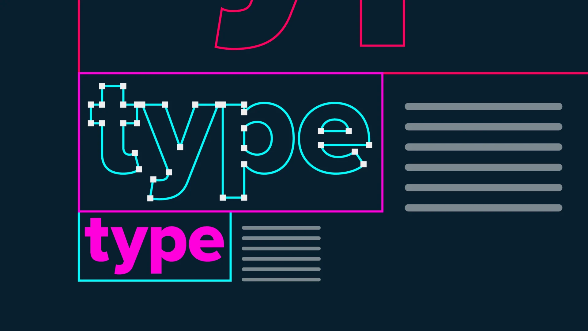
Typography refers to both the design of the letterforms and the way text is laid out. In simple terms, it is how your words look and, as a result, how they feel. The use of fonts specifically – the files on your computer that affects the look of the letters – is the way you control this.
It can sound technical, but most people already engage with typography every day. Every presentation deck, user interface, social post, website or document involves font choices, whether consciously or not. And that is your opportunity for your brand to assert itself.
At Arke, we use typography consistently across our own brand communications because repetition builds familiarity. Over time, those visual cues become part of your identity in the same way a logo does.
Imagine the exact same sentence written in two different fonts. One version might feel authoritative and established. Another could feel informal and energetic. The wording has not changed, but the perception has.
That is the power of typography. Let’s AB test this.
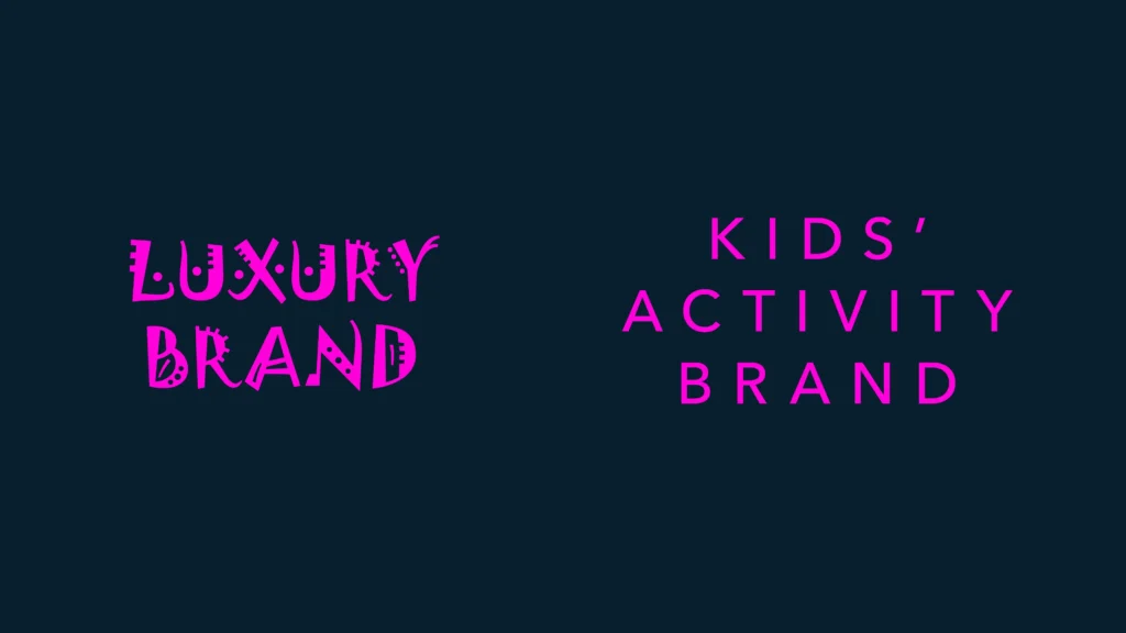
You would not expect a luxury brand to communicate using Jokerman, just as you would not expect a children’s activity brand to use something rigid and corporate. These choices aren’t simply decorative. They because the font communicates personality, positioning and intent.
Typography acts as your tone of voice in visual form. Rounded letterforms can feel softer and more welcoming. Sharp edges can feel more technical or formal. Tall, elegant typefaces might feel premium, while heavier fonts can feel bold and dependable.
When you’re rebranding, these nuances become incredibly important because every design choice contributes to how audiences understand your organisation and offering.
One of the biggest mistakes organisations make during a rebrand is leaving typography until the end.
Often, a font gets selected simply because it is accessible, safe or already installed across all the computers in the business. While practicality matters, choosing typography purely for convenience can weaken an otherwise strong visual identity.
Your typeface system should work as hard as your logo or messaging strategy. Because typography appears so consistently, it becomes one of the most recognisable parts of a brand over time.
Think about major public-facing organisations. Transport systems, healthcare providers and global brands all rely heavily on typography to create consistency and recognition.
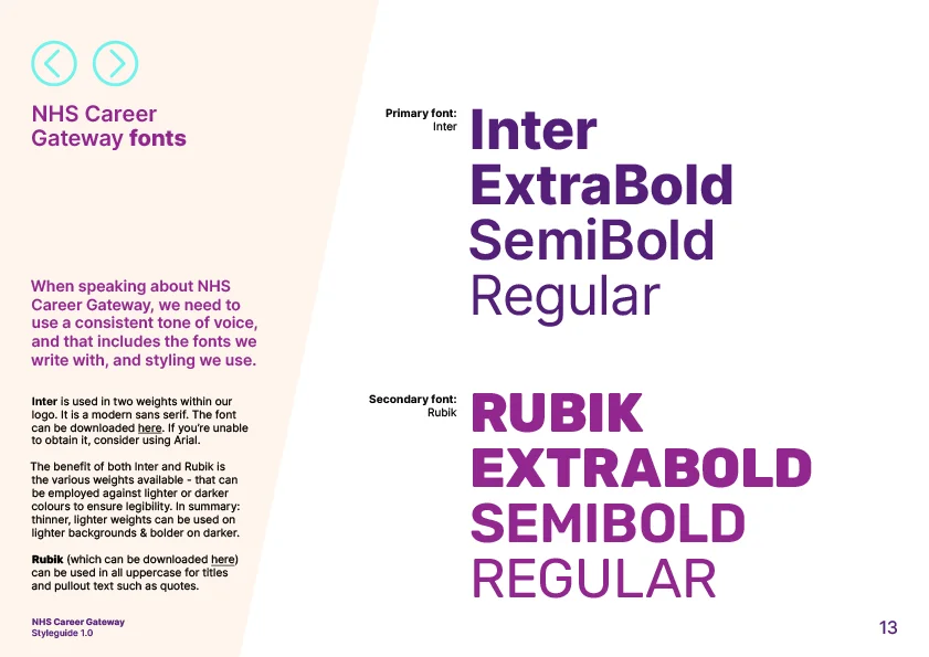
In the UK, the NHS uses Frutiger across its signage system because it is clear, legible and dependable. Airports rely on typography to guide people quickly and confidently through complex environments, so use the same font across their wayfinding systems.
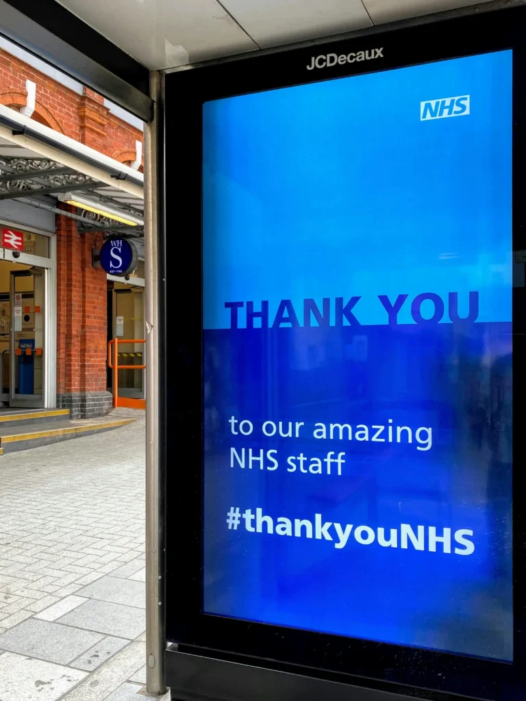
Your brand can operate in exactly the same way. Consistent type choices create a visual signature that audiences begin to recognise instinctively.
That consistency becomes especially important during a rebrand, when audiences are learning to recognise a new visual identity.
A useful exercise is to think about your typography as clothing for your brand.
Would your organisation wear a tailored suit, a practical waterproof jacket, or something more expressive and unconventional? None are starkly right or wrong, but they all say different things.
The same applies to fonts. The best typography choices feel intentional. They support your positioning rather than undermine it.
Fonts rarely work in isolation. A typeface that looks beautiful on a moodboard may feel entirely different once applied across a website, campaign or social platform.
That is why testing matters. We test fonts as part of a new brand identity, rather than quickly select them at the end – they’re the backbone of your look and feel.
When developing brand identities or campaign styles, we regularly explore multiple typographic directions before settling on a final route. The same messaging can take on completely different tones depending on the type choice made.
Testing font choices and text styling in context helps answer important questions:
Good typography is not just about aesthetics. It also needs to function effectively across teams, platforms and audiences.
That means considering:
Choosing a font that nobody else in your organisation can access creates unnecessary friction. Equally, selecting typography that is difficult to read weakens communication no matter how visually striking it is.
Accessibility should never be treated as separate from creativity. “Don’t confuse legibility for communication” as disruptive designer David Carson once wrote in a way that challenged the phrase’s readability. The best brand systems balance both.
If you’re reviewing your organisation’s typography as part of a rebrand, ask yourself:
“What does this font suggest about us before anyone reads the words?”
Does it feel confident? Friendly? Institutional? Progressive? Premium? Dated? Even better, test those perceptions with real audiences. Sometimes associations or interpretations emerge that internal teams have completely missed.
If the perception created by the typography does not align with the brand strategy, the font choice is working against the rebrand rather than supporting it. So look to explore alternatives.
Your words carry meaning, but typography determines how that meaning shows up. That’s why font choice should never be treated as a finishing touch during a rebrand process. It is one of the core building blocks of your visual identity. At Arke, we treat font options as an integral part of a rebrand, and ensure that they’re suitable. Your rebrand shouldn’t be a series of compromises and near-misses, but instead the most suitable and compelling look to propel your business.
The right typography helps audiences recognise you, trust you and remember you. It creates consistency across every touchpoint and strengthens the emotional impact of your messaging.
In other words, typography is not simply part of your visual identity. It is part of your brand strategy.
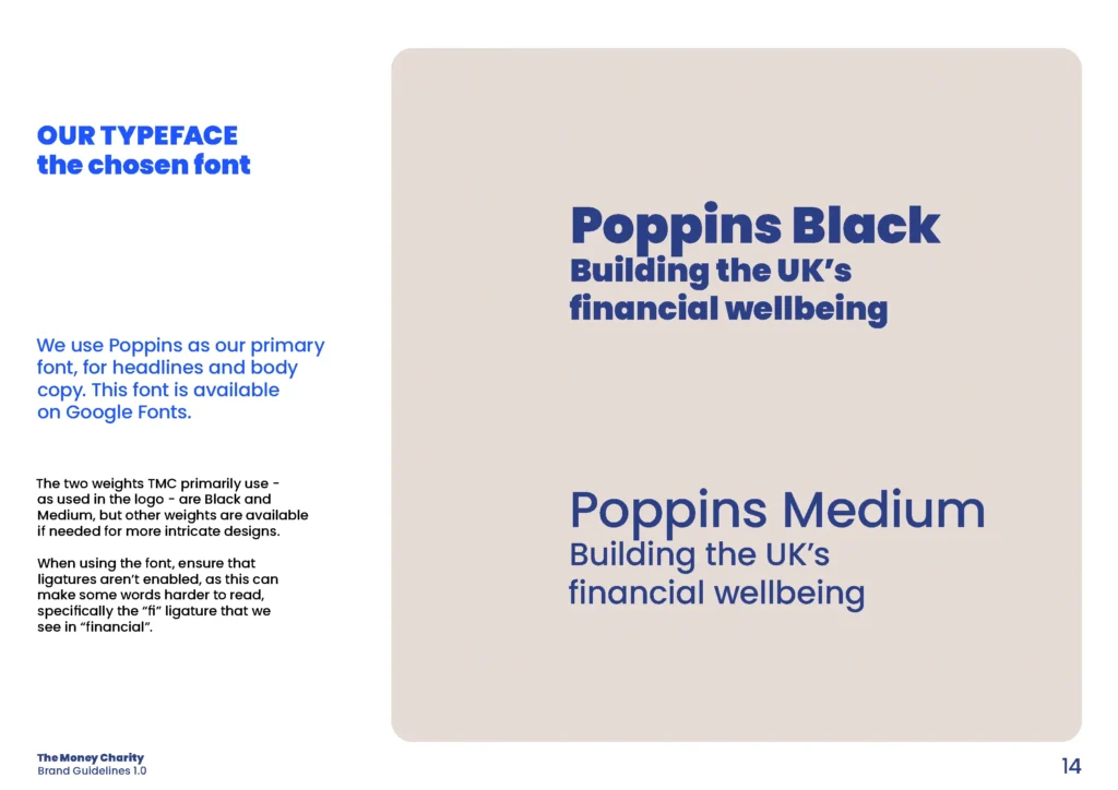
Here’s an example of a complete rebrand project with The Money Charity that included the redesign of their logo, and update of their colour palette, typography, and other core components to communicate to a range of diverse audiences.
As a specialist branding agency, Arke has experience across a number of market verticals and sectors, which allows us to bring a wide and unique perspective to create the impact your organisation needs.
Got a mission for us? The Arkenauts are all ears! Book a call, drop your brief or enquiry into our digital portal, and we’ll be in touch straight away!