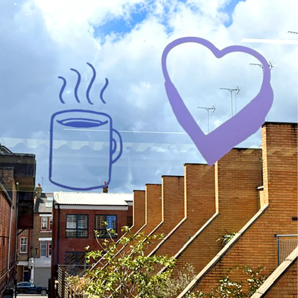
We delivered for The Money Charity
- A fresh new central brand alongside three different sub-brands tailored to the charity’s wide main audience groups.
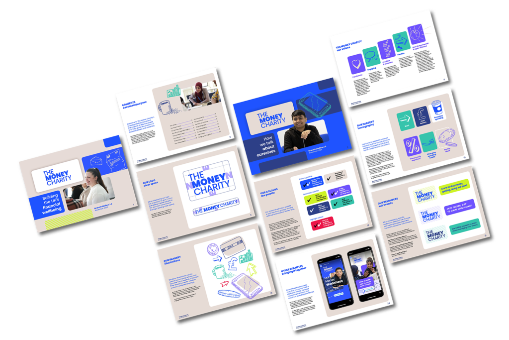
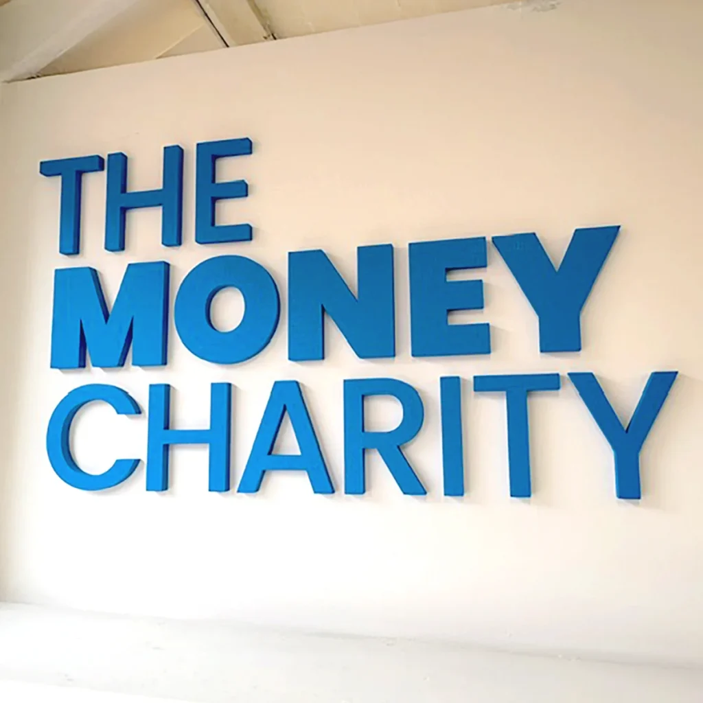
- Updated visual elements, including a new logo, colour palette, typography, and other core components.
- Created a cohesive contemporary identity that balances professionalism with approachability.
The Background
As part of our annual commitment to giving back, Arke selects a small number of charity or community-focused projects each year to support on a pro bono or reduced-fee basis. We connected with The Money Charity after learning they were looking for support with their branding.
That’s how our relationship with The Money Charity began – they’re a charity that empowers people across the UK to develop the skills, knowledge, attitudes and behaviours to make the most of their money throughout their lives by providing education, information, advice and guidance to people of all ages and life stages, and were looking to reimagine their central brand and update their internal and external communication decks.
As The Money Charity aims to help children and people of all ages, the brand needed to resonate across a wide and varied audience spectrum:
- Children (primary school age)
- Young people (tweens, teens, students)
- Adults across different demographics and life stages
They also work with large corporations to deliver training on financial well-being. This mixed audience required a careful balance between professionalism, clarity, and approachability.
The Mission
The project focused on delivering a full rebrand that would:
- Refresh and modernise a brand that had remained largely unchanged for over a decade.
- Improve accessibility and relevance for diverse audiences.
- Provide clear internal guidance for consistent brand application.
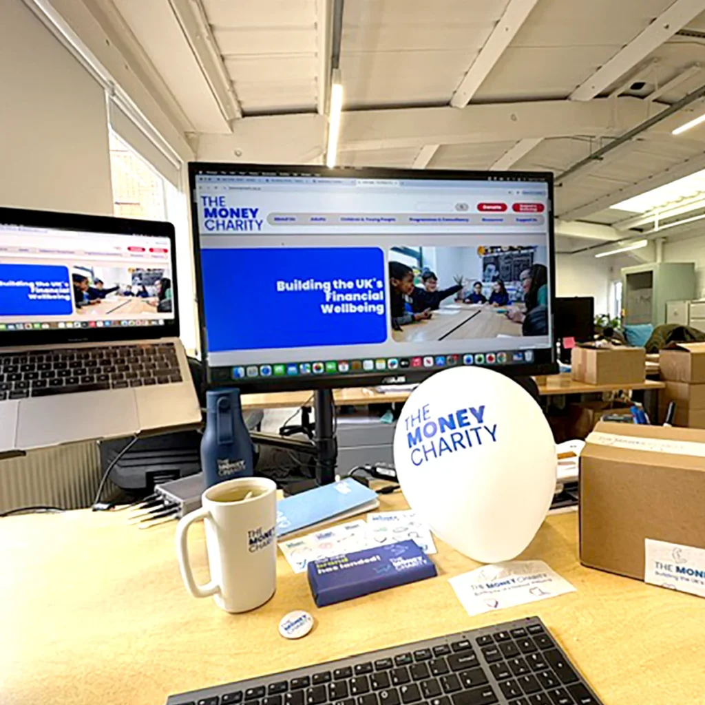
- Lay the visual foundations for a new website experience.
Our goal was to develop a flexible and accessible brand system
that empowered the team to produce high-quality materials independently.”
Matt Stokes
Arke’s Head of Creative


The Strategy
We began with a collaborative discovery phase, engaging key stakeholders through a deep-dive online workshop and explored how to convey the organisation’s history and existing brand perception visually.
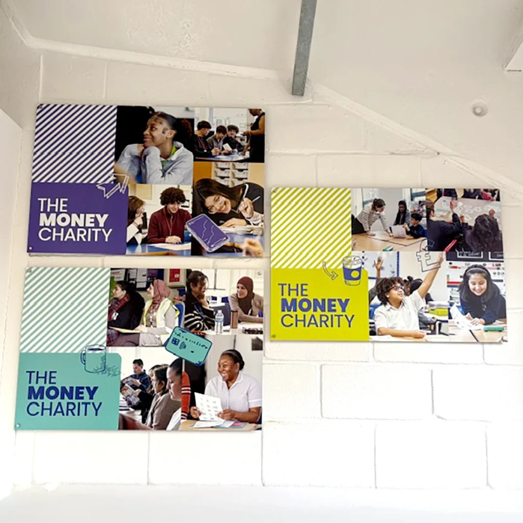
From this workshop, we identified the need to create a flexible identity system that supports multiple audience segments.
We also discussed key audience needs and expectations, presented a competitor analysis, broader landscape research and positioning opportunities, by working directly with the team at The Money Charity, who have client-facing roles and knew their audiences and provided the training to all, from students to corporate groups.
This transparent and detailed communication ensured alignment on both creative direction and strategic intent.
The Creatives
After the deep-dive discovery workshop, we developed multiple creative routes:
- A refined evolution of the existing identity
- A more progressive and expressive reinterpretation, which included the creation of subbrands to resonate with different audiences
We continued to have open ideation sessions with the key stakeholders, providing an iterative approach which allowed stakeholders to explore bolder directions before ultimately selecting a more balanced and versatile solution.
The selected concept was developed into a complete brand system:
- Creation of a fresh new central brand with supporting sub-brand variations.
- Updated logo, colour palette, typography, and visual language, which included an illustration style to guide future creatives.
- A cohesive identity designed to work across multiple audiences and channels.
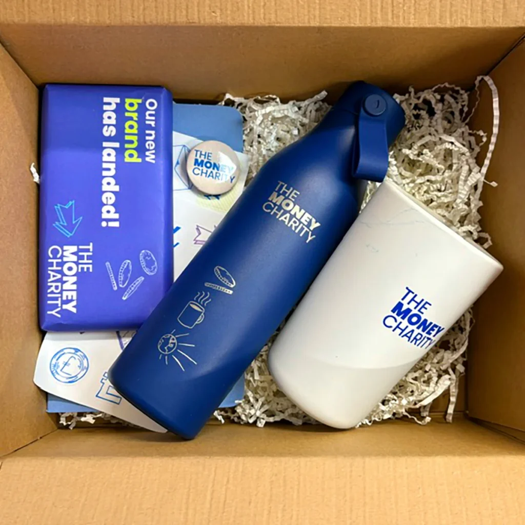
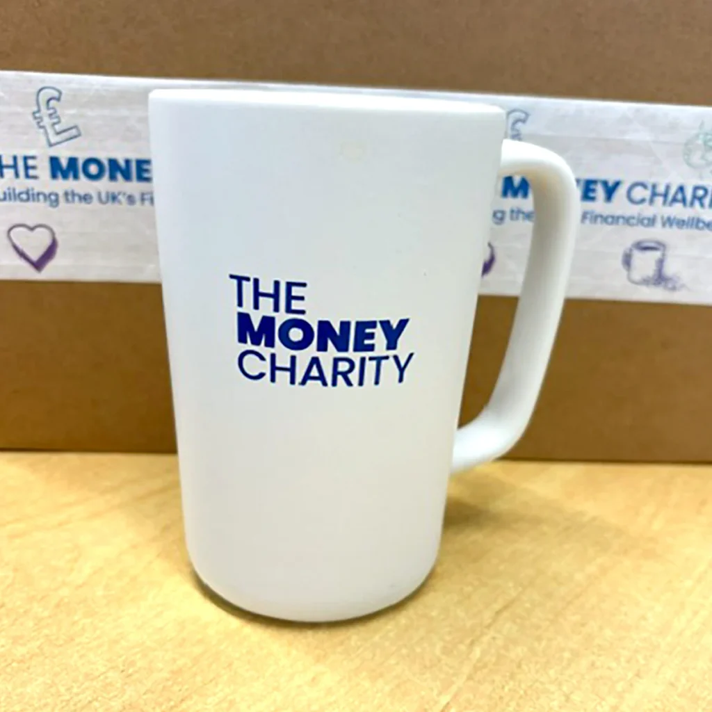
We then consolidated this into a comprehensive and practical Brand Guidelines Document, a style guide for internal and external use, website visual concepts and templates to guide future development, presentation templates (PowerPoint) and supporting marketing and communication assets.
The Results
We delivered to The Money Charity:
- A modern, credible, and approachable identity.
- A flexible system that works across diverse audience groups.
- Clear, user-friendly guidelines enabling consistent brand application.
- Digital-ready assets supporting the website rebuild by their team.
The Money Charity’s fresh look and improved website support ongoing growth, engagement, and impact across audiences ranging from children to adults to corporate partners all throughout the UK.
The new brand assets are also being used to create presentations and reports shared with policymakers and stakeholders, demonstrating the importance of a clean, accessible, and memorable brand identity.
The Impact
This brand redesign for The Money Charity shows what thoughtful, strategic branding can do.
By creating a flexible, modern identity system for a wide range of audiences, we helped position the charity for stronger engagement, better accessibility and long-term growth.
Effective charity branding is about more than aesthetics: it’s about helping organisations communicate their mission clearly, confidently and consistently. At Arke, we believe charity branding should empower organisations to grow, evolve, and amplify the work they do every day. Looking to elevate your charity branding and create a brand identity built for long-term impact? Let’s get started today.
We needed a brand that modernised the charity, preserved our fun, whilst also having credibility and gravitas.
No mean feat to balance all those elements. But Arke did it – and we love the end result!”
Michelle Highman
Chief Executive at The Money Charity
Google Pagespeed insights results
Performance
Accessibility
Best practices
SEO
The need for a website redesign
In the fast-paced agency world where we dedicate all of our resources to our clients, we realised that to practice what you preach, you need to lead by example.
Delivering award-winning integrated marketing campaigns for our clients and not using our expertise to our own benefit may sound mad, but it’s the harsh reality of many businesses out there. So, we decided to rebuild our website properly with a sound strategy rather than patching the elements that needed to be fixed.
True to our values, this case study transparently reflects where we were performance-wise, what we achieved and how an ongoing marketing strategy can re-position even a well-established business to reach new audiences, so you can see what we could do for your own organisation.
The baseline
Whilst the old website was ranking really well for best practices and SEO, we had plenty to improve across overall performance and accessibility, both across desktop and mobile.
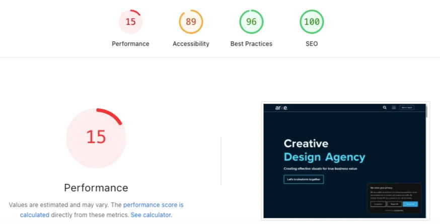
However, even though for SEO we had a 100/100 score, this was not really reflected in our visibility across Google results and AI overviews which not only was anecdotally reported but SEMRush backed up this finding too .
Working with the Elementor CMS presented its own issues: whilst it can certainly be a valid CMS for some organisations, the way it was implemented across our site didn’t allow for good responsiveness across devices, and some elements that were arguably visually attractive didn’t match industry best practices for accessibility and SEO.
As a result of responsibility changes at Arke over the years, internal marketing efforts became misaligned from business goals. As a consequence, the backend had become cluttered with a number of plugins whose purpose and functionality were unclear. This not only increased the need for constant updates and testing to ensure the site remained stable, but also introduced potential security warnings by having several unnecessary third-party applications installed for no apparent reason.
The brief
Arke’s old website had performance issues coming from a convoluted backend, built on WordPress, using Elementor as a CMS and a multitude of plugins, some of which were conflicting with each other.
The brief to our web developer was to create a clean-coded Arke Agency theme, with accessibility, SEO and UX best practices by design across devices to support our aim as an authoritative voice in the agency space leading to demand generation.
Combining custom-made blocks with WordPress’ native ones, we designed a dual brand language, based on the content of the site, with landing page layouts for our service pages and an editorial layout for our case studies and thought leadership articles.
We needed to revamp the entire UX across the site, simplifying the navigation for ease of use and more impactful communication of our services, results and thought-leadership.
Some of the main KPIs we set for the development were:
- Achieving at least a score of 95 on each category on Google’s PageSpeed Insights.
- Be compliant with WCAG 2.2 accessibility requirements.
- Keep the project on time and on budget.
Strategy
Being a fully integrated agency means that we have strategic and creative resources at our disposal. We took the website redesign as an opportunity to refresh our brand, maintaining our values and our personality whilst also showing our professionalism and ability to deliver award-winning marketing work.
We stripped down the graphic noise to focus on substance, combining it with subtle animated elements to drive user engagement where we want it the most.
The project didn’t need just a new website; it included the design of an ongoing SEO strategy, a curated content development plan, precisely targeted lead-gen campaigns and the establishment of new systems for producing web assets.
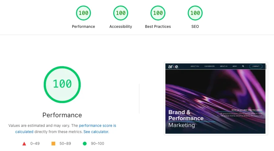
Results
- Upon launching the site, we achieved 100 points in each of Google’s PageSpeed Insights sections: performance, accessibility, best practices, SEO. This represented an improvement of over 500% for some key pages across the website.
- Our content and digital PR strategy, which started before the new website went live, made us climb quickly on strategic keywords we were not ranking before, taking us to the first page of Google and gaining AI citations to increase our reach. Same as we do with our clients, this strategy is ongoing and will only get stronger with our ongoing optimisations.
- We reduced the backend plugins from 32 to 13 without compromising on any functionality and securing our website against potential vulnerabilities.
- With accessibility being one of the points we stressed the most during the design phase, we ensured to have zero critical issues before launch and 42/42 passed audits under WCAG 2.2 criteria.
Curious to talk about it?
A website is much more than the window display your organisation offers to the world. It has never been more critical to have a technically sound website, both to reach your audiences and remain visible where the conversations begin, especially in a highly competitive landscape, but also from a legal responsibility, as accessibility and privacy by design are requirements for any organisation in the UK with a website.
It’s not always necessary to do a complete website redesign as you may already have solid foundations that need to be strengthened with UX best practices so let us know what you would like to achieve so we can help you get there faster.
Our Brighton-based team of Arkenauts have developed and designed websites and marketing strategies for organisations across over 15 sectors, including ecommerce, travel, entertainment, education, and much more for many years. We’ve got the toolbox of solutions; bring us your unique needs and let’s get your brand in front of the right audience.
Google Pagespeed insights results
Performance
Accessibility
Best practices
SEO
We hold ourselves to the same standard we expect for our clients. Rather than patching bits up, we rebuilt properly and with purpose;
putting our visitors at the centre of our vision.”
Steph Noble.
Founder & CEO
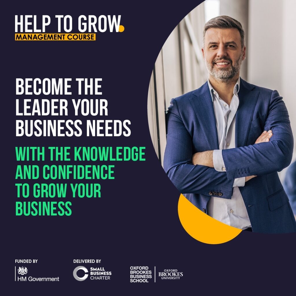
CTR on paid ads
Over target, exceeding all budgeted enrolment goals
With a tailored strategic plan focused on driving sign-ups for the Help to Grow course, we achieved impressive growth and exceeded our goals.
These results enabled us to meet our year targets ahead of schedule.
This strong performance also allowed us to reallocate the remaining budget to future activity, ensuring every penny was used efficiently and delivered maximum value for our client.
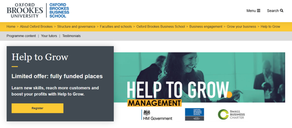
The Background
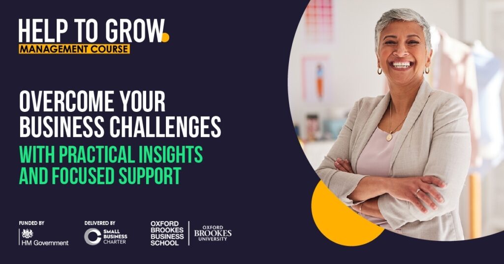
Oxford Brookes Business School’s Help to Grow initiative is a government-backed scheme that empowers leaders in small and medium-sized enterprises (SMEs) across Oxfordshire to grow professionally and strategically. It is a 12-week programme designed for senior leaders to help them build the skills needed to take them and their business further. The programme includes support from a business mentor and is designed to fit alongside full-time work.
Long Standing Partnership
We have partnered with OBU for several years, gaining deep insight into their priorities and what drives their success. Through consistent collaboration, we have built strong trust with their teams, enabling seamless teamwork and positioning us to deliver impactful, long-term results.
Our Latest Mission
We set out to drive enrolments for the Help-to-Grow programme, empowering more business leaders to take their skills and their businesses further. Our goal: at least 15 sign-ups per cohort, with a stretch target of maximising each group’s full potential. With under 12 months to achieve it, we were ready to deliver exceptional results.
We specifically targeted senior business professionals from SMEs based within a 30-mile radius of Oxford (including Oxfordshire and Buckinghamshire). Working with a specific media spend budget to cover a 9-month campaign, we knew we had to be agile and reactive with our optimisations to maximise our budget and get the best results.
Strategy in Action
Achieving our targets required a strategically built marketing funnel.
-
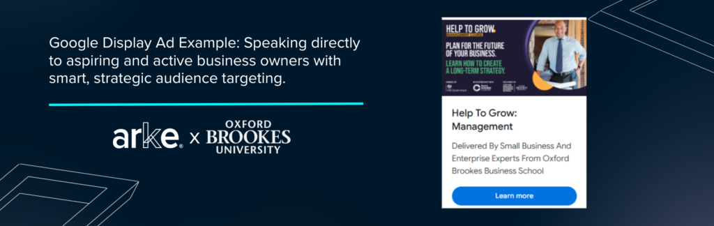
- To raise awareness at the top of the funnel, Google Display was utilised to retarget website visitors alongside reaching high-intent prospective audiences who were most likely to convert in specified timeframes.
-
- Utilising interest layering, such as demographic targeting and URL targeting, to reach users who had previously interacted with relevant brands further increased the likelihood that our ads would reach the most engaged audience at the right time to convert.
-
- Over time, we moved away from retargeting because analysis showed the activity generated limited website traffic, and we wanted to prevent ad fatigue and prioritise fresh audience engagement.
To refine our Google Display targeting, we crafted affinity audiences focused on:
-
- Business professionals.
-
- News enthusiasts.
-
- Frequent business travellers.
-
- In-market audiences for business education.
Demographically, we targeted individuals aged 25-65+ who were either planning to start a business or had recently launched one. To maintain precision, we implemented negative placement targets to exclude irrelevant audiences. Specifically, we filtered out users aged 18-24 and retirees, ensuring our focus remained on senior business leaders. We also utilised URL targeting and auction insights to ensure we were reaching users who had previously looked at competitors.
Supporting our lower-funnel strategy required a more targeted approach, which made LinkedIn Ads an ideal channel. We targeted three audiences on LinkedIn:
-
- Users at Director and Managerial seniority levels.
-
- Users who had “Business Owner” or “Manager” in their job title.
-
- Users who listed Management & Leadership in their skills.
To avoid high CPC due to advertising against high-cost audiences, we also set cost caps to allow us to stay on top of budget usage throughout the campaign effectively.

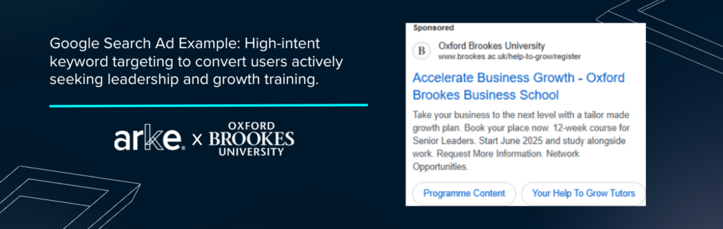
Last (but certainly not least), we primarily utilised Google Search with high-intent keyword targeting for our bottom-funnel strategy to generate conversions.
Our main keywords were:
-
- Leadership courses.
-
- Management courses.
-
- Mentorship.
-
- Strategy and planning.
-
- Small business growth.
-
- Help-to-Grow branded keywords.
By continuously monitoring performance, we reallocated budgets to the highest-performing channels, enabling us to stay agile and user-focused with our optimisations throughout the campaign and deliver impactful results.
Challenges
Our most significant challenge came during the UK general election, when government-backed campaigns such as Help to Grow were paused to comply with restrictions. We had to pause all activity for the entire month of June, which condensed our timeline from 3 months spanning June to August, to only 2. All budget that would’ve otherwise gone towards the June activity was held and redistributed to July and August.
-
- Whilst we did experience lower numbers due to having less time to generate momentum for sign-ups, we still surpassed budgetary enrolment targets by 153%!
Another challenge we faced was strong competition from other local business schools delivering the Help to Grow programme, as well as from the Small Business Charter (SBC). The SBC, which accredits UK business schools, runs its own national advertising campaigns. This created overlap with our highest-spending keywords in biddable auctions, meaning our campaigns were effectively competing not only with other local providers under the SBC umbrella but also with national SBC activity itself.
To overcome this, we closely monitored keyword performance, refined our targeting strategy, and focused on high-intent, region-specific terms that aligned more directly with Oxford Brookes University’s offering.
-
- This approach reduced unnecessary bidding competition, improved cost efficiency, and ensured our campaigns maintained strong visibility and performance despite the crowded landscape.
Breakthrough Success
Our long-standing partnership with Oxford Brookes University has gone from strength to strength over the years as we saw remarkable growth for Oxford Brookes Business School throughout our campaigns.
-
- In the first year of our campaign, enrolments increased by 125% year-on-year.
-
- The next year, we exceeded registration targets by 73%, enrolling 164 participants across six cohorts, enabling OBU to support even more business leaders in the region.
-
- Our most recent campaign marked a standout milestone, as we filled all 30 seats in the cohort ahead of schedule. With the remaining marketing budget, we focused on building broader awareness of OBU and the Help to Grow scheme, ensuring every penny was used to maximum effect.
Exceptional Results
Google Search was the standout performer, achieving an impressive account average of 11.14% CTR and driving 132 registration clicks in the campaign’s final months, surpassing budgetary enrolment targets by 153%.
This success demonstrates the power of a well-executed strategy, thoughtful targeting, the importance of campaign agility, and our commitment to maximising the marketing campaigns’ full potential.
Ready to achieve your goals?
As a brand and performance marketing agency, our Brighton-based team transforms your unique challenges into tailored strategic solutions that exceed expectations. We deliver award-winning results that help you scale your brand and deepen engagement with your audience.
Are you looking to supercharge your higher education marketing?
Let’s talk through it.
CTR on paid ads
Over target, exceeding all budgeted enrolment goals
Arke did a great job of understanding our business needs and putting together a marketing strategy
to increase course sign-ups.”
Mona Gerken
Business Development Officer
Oxford Brookes Business School
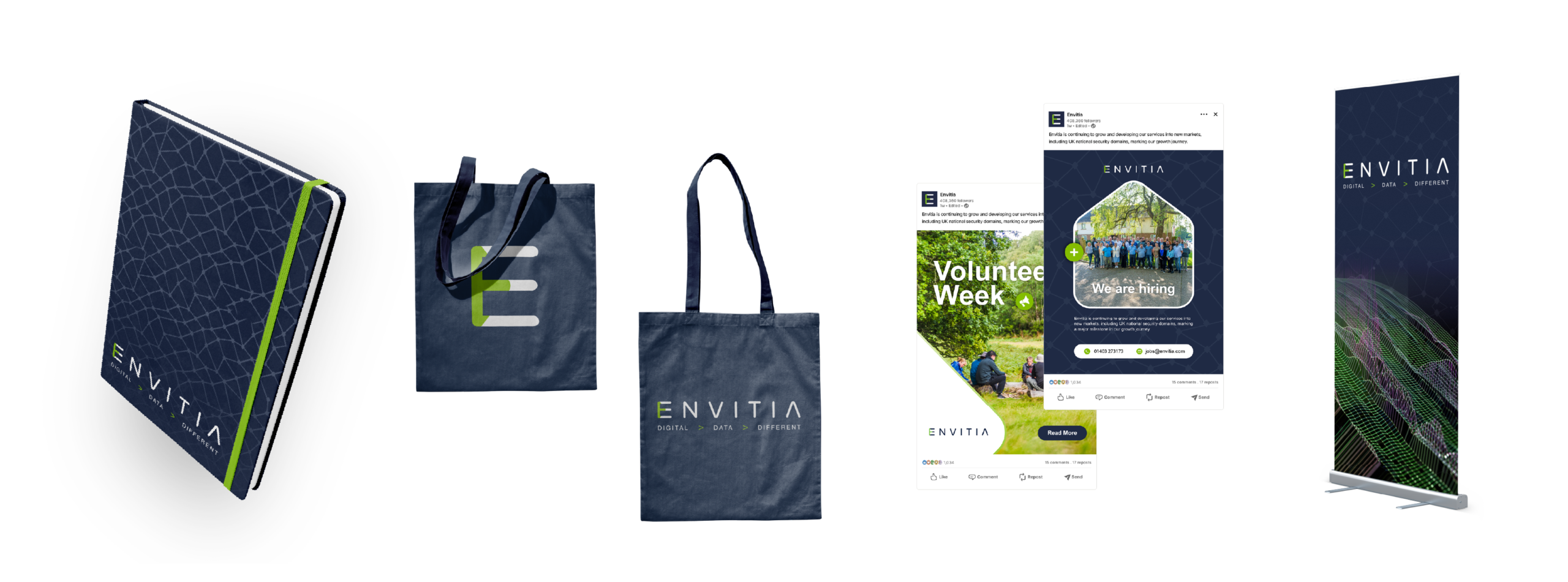
We delivered for Envitia
- The Arkenauts developed a simplified and coherent brand, consistent across digital and physical assets.
- We designed 20+ bespoke and aligned brand elements for different organisational needs.
- We created 16 tailored icons for internal and external communication, simplifying their complex work while keeping their brand identity memorable and fresh.


The Brief
Envitia is a software and digital services company that specialises in solving complex data challenges. With work that spans industries such as environmental, maritime, and defence, their work is vital and often complex.
Recognising that it was time for a brand refresh, they reached out to Arke’s Creative Team for help to update their brand guidelines and develop new templates for their presentation decks.
They wanted to modernise their identity, designing something cleaner while holding on to the familiar core elements their key stakeholders recognised.
The goal was to refresh Envitia’s visual identity, which Arke then encapsulated in an updated set of brand guidelines. These were then rolled out and applied to key brand assets, sales and marketing collateral, and were to be applied across their website and social media templates later.

A Strategy for Clarity
Our brand development strategy centred around cutting through complexity. Envitia works in challenging sectors and often tackles highly technical issues, so its brand must communicate a minimalist and confident vision without diluting its expertise.
We collaborated closely with the team to understand their business and ambitions, then delivered a solution that balanced creativity with practicality while meeting both budget and schedule.

We saw an opportunity to bring more depth by introducing a secondary colour palette
that complements the core brand while adding flexibility and warmth.”
Blair Foley
Arke’s Design and Animation Lead

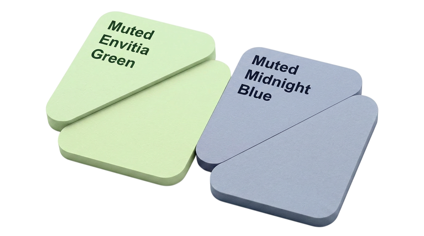
Colour Palette Refresh
These new tones allow Envitia to tell richer stories, clearly differentiating presentation segments. The secondary warmer, brighter tones provide contrast to the primary Midnight Blue and Envitia Green colours, which would be used to make diagrams, charts, and infographics pop.
We also created muted versions of the primary blue and green, which would be used for overlaying body copy, adding dimension to their presentations.
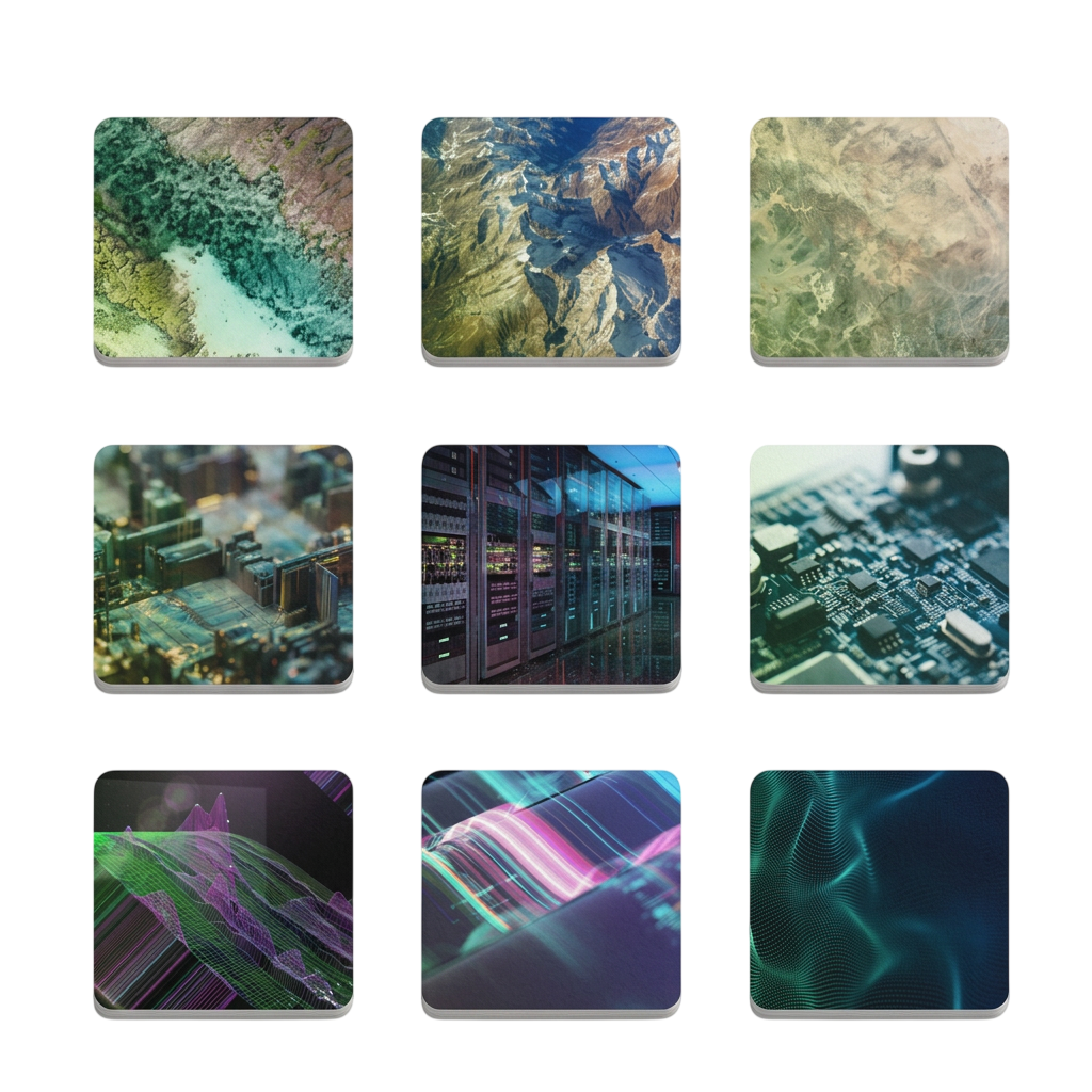
Imagery Treatment, Ownership, and Modernisation
It was a priority for both Arke and Envitia to “own” their visual narrative, making their brands easily distinguishable and memorable.
To achieve this, we introduced customised imagery treatments: the photography was divided into four visual groupings, and custom overlays, filters, and graphical elements were applied to photographs, creating a distinctive and recognisable aesthetic.
This approach not only enhanced visual appeal but also ensured consistency across all platforms and materials.
One of the biggest challenges we faced came from the technical nature of Envitia’s work.
By translating dense and intricate information into clear visualisations, we gave Envitia a way to communicate complex ideas confidently and easily.
The result was a refreshed brand identity that feels both modern, credible and timeless, while staying true to the company’s foundations.
The new guidelines and collateral have empowered the internal team to present a consistent and professional image across all platforms, producing better brand alignment and internal adoption.
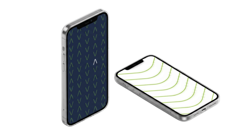
Patterns with a Purpose
Continuing to add variation to Envitia’s graphic portfolio, we created patterns inspired by geospatial elements that were integrated into the brand’s visual language.
These patterns served as subtle nods to Envitia’s core services, adding texture and depth to their communications while maintaining a clean and professional look and would be used to introduce visual breaks in documents and presentation decks.

Enhancing the brand refresh
Envitia were thrilled with Arke’s work in providing them with an easy way to communicate their complex ideas and knowledge with simplicity and confidence.
Envitia’s brand, however, isn’t limited to the digital space – it also needs to live and breathe in the physical world, extending beyond the logo to create a unified and adaptable brand experience. From staff materials and event assets to promotional items and social media, Envitia’s brand is designed to grow, evolve, and make an impact wherever it appears.
Your rebrand is here
As a Creative Marketing Agency, our Brighton-based team takes complex challenges across a range of industries and deliver award-winning results so you can scale your brand and engage with your audience further.
Ready to update your brand? Let’s talk through it.
Thanks for the enthusiasm from your side as always, your team has
definitely won everyone over with their positivity which is always lovely.”
Becky Hynes
Senior Marketing Manager
Success At a Glance
YoY Increase in Peak Months' Trials
Increase in Trial to Paid Conversion Rate
Conversion Rate Above Target
The Arkenaut’s Assignment
As of the summer of 2025, 20.6 million UK households were subscribed to at least one paid video streaming service. In this crowded market, our long-term client, the British Film Institute (BFI), asked us to help BFI Player broaden its audience and stand out among streaming giants.
The Arkenauts jumped into the director’s seat, crafting a full-funnel digital strategy to drive free trials through a full-funnel digital strategy, nurturing users from awareness to conversion.
With a comprehensive marketing strategy spanning paid media and creative implementation, we combined targeted video and static ad campaigns featuring BFI branding, optimised search advertising, and robust retargeting, enhancing BFI Player’s brand awareness as a streaming service.
Utilising an “always-on” approach for paid search and paid socials, we divided the media plan into priority releases, back-catalogue, and brand-supported campaigns with flighted campaigns during key periods.
Our targets were:
-
- Increase average free trialists per month.
- Increase free trials during the peak January/February period by 100% YoY.
- Trial to paid conversion rate of 50%.
- Keep paid subscribers churn in line with -/+ of platform average.
Audience in Focus
BFI Player’s core audience was UK adults aged 25 to 54, interested in independent film and Video on Demand (VoD). Arke’s challenge was to reach a broader UK audience, especially at a time when many people were facing reduced disposable income due to the cost of living crisis.
Our goal was to position BFI Player as a serious competitor to the streaming giants, while growing and diversifying its subscriber base.
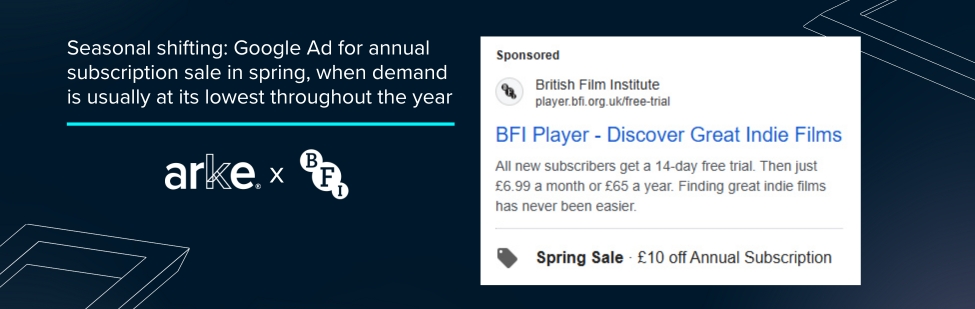
To target audiences more effectively throughout the year, we introduced a seasonal strategy shift. With BFI Player typically seeing a spike in January and February, we focused on conversion efforts during this period. In summer, we pivoted to a search-led approach, with plans to scale media spend again in winter when VoD interest naturally increases.
Churn was another key challenge. As is common with subscription models, drop-off rates were expected, so we built in regular promotions to reduce this. An always-on campaign was supported by tactical bursts around key retail moments such as Prime Day and discounted subscription offers, all designed to keep churn low and conversions high.
The Drawing Board – Creative Asset Development
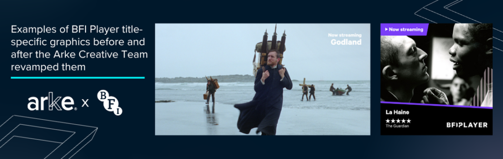
Before we began, Arke’s Head of Creative and Head of Strategy facilitated a Creative Workshop, with the aim, to identify the opportunities available to evolve creative assets, whilst aligned with the eventual evolution of the BFI Player brand. This enabled us to create eye-catching graphics with a clear CTA.
Replacing some of BFI’s creatives would also future-proof the BFI by providing them with innovative tools and templates for sustainable, in-house asset production.
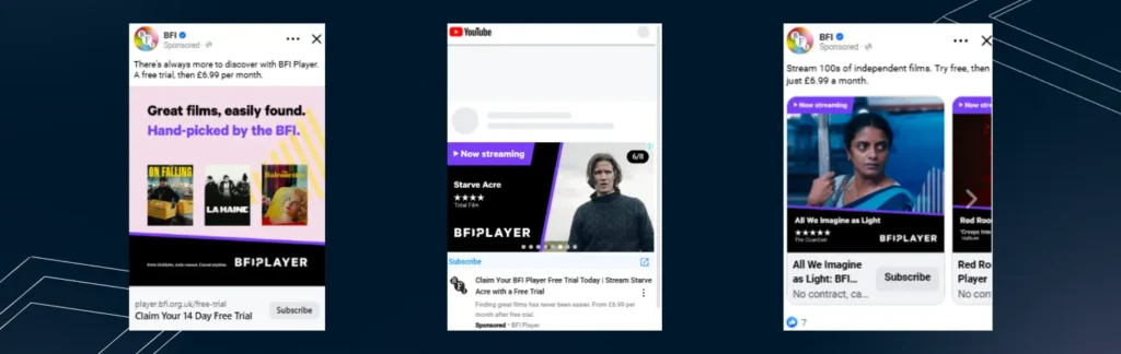
Our creative team changed the previous creatives from a 9:16 to 1:1 dimensions, as previous campaigns showed that 9:16s typically see higher CTR’s and lower CPCs at the video viewer retargeting level.
Clear branding allowed with brand recognition, and a linkable and clickable CTA allowed for trackable and reportable results.
Working with BFI’s creative department, 14-day free trial messaging was split-tested amongst audiences within the creatives to understand if this or the price point led to more trialists becoming long-term subscribers and which message should dominate on landing pages.
Messaging was regularly reviewed and iterated, with pricing transparency emerging as a key conversion driver amongst mid and bottom-funnel segments. Arke then created and templated optimised assets for BFI teams to utilise for the subsequent releases.
Ads needed to work across 12 different formats, requiring significant design flexibility while ensuring consistent branding, messaging and promotions.
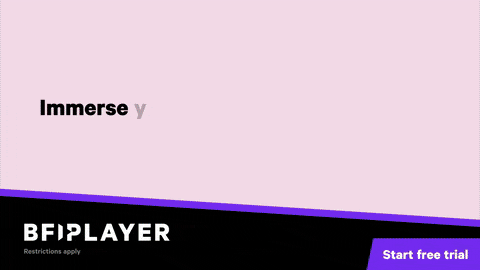
The core messages were: “Stream hand-picked cinema” and “Immerse yourself in indie film“.
The final product: a unified visual identity that enhanced campaign cohesion. Engaging video and static ads effectively communicated subscription benefits, capturing audience attention across segments.
Funnel Stages
The first step was to increase awareness. Arke launched campaigns using YouTube, SkyAdSmart, and Meta, building awareness among targeted audiences and creating high-quality retargeting pools.
Since BFI Player is now available via Amazon, Amazon DSP Ads were our programmatic provider, with exclusive access to IMDB. Arke extended the use of Amazon DSP, TikTok, and Meta to drive engagement and traffic to BFI Player via Amazon Prime, optimising for maximum volume with a target CPA.
We didn’t simply target the core audience: using additional audience segmentation, we were able to customise the strategy based on film-genre interests and mosaic groups through Experian.
At the top of the funnel, we targeted users with a broad interest in indie film, layered with VoD consumption behaviours across Meta and YouTube. We also added title-specific targeting, building custom audiences around film titles.
Mid-funnel, we leveraged rich BFI first-party data to build high-intent lookalikes and niche interest segments, and at the bottom of the funnel, we used highly segmented campaigns targeting high-intent queries, retargeting users who visited the site and didn’t subscribe, or watched <75% of video content.
Performance activity across decision-stage platforms focused on cost-effective trial starts and subscriptions, optimising to a target CPA. Finally, we activated a hyper-targeted Google Search strategy, reaching high-intent users through genre-specific and title-led targeting.
We developed a comprehensive full-funnel strategy to nurture users throughout the customer journey.
-
- Prospecting focused on interest and behaviour-based targeting, with creative assets optimised for awareness and discovery.
- Mid-funnel audiences were reached with engagement-focused creatives, informed by tested audience data (e.g. lookalikes, layered interests).
- Retargeting was segmented to reflect intent signals, with messaging focused on price and exclusivity of content.
Arke’s Integrated Approach
We understood that the new, broader target audience we wanted to reach spent their time in various communities on the internet, so we placed BFI Player there as well.
We used Reddit to interest groups and subreddits targeting niche audience engagement in specific threads like r/A24 or r/ObscureFilmClub. We used Spotify‘s genre targeting of indie film enthusiasts, and Sky AdSmart for geographic/demographic targeting with viewing passions overlaid.
Results: A Standing Ovation
Despite the complexities of modernising an established brand like BFI Player, Arke successfully revamped assets across six channels to attract a diverse audience and achieved incredible results
Primary Objectives: Increase Free Trials
- Target for the campaign: Increase of free trials per month
- Result: 33% above target achieved
- Target for peak period: During the peak January–February window, we achieved a 20% increase on target and 729% YoY increase
Secondary Objective: Trial-to-Paid
- Target Conversion Rate: 50%
- Result: Achieved a 52% trial-to-paid conversion rate, a 4% increase on target
Retention Objective: Churn
- Target: Maintain churn in line with the +/- of platform average
- Result: Achieved churn within range
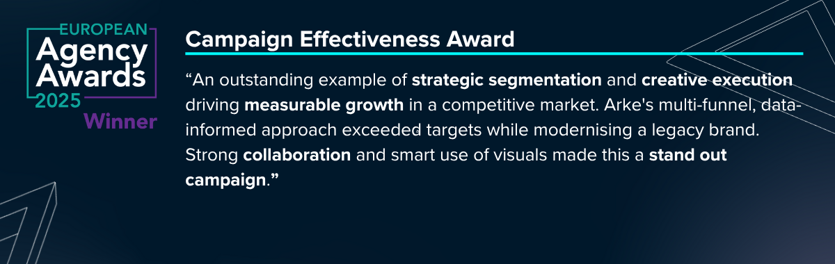
European Agency Awards 2025
The Niche to Known campaign won the European Agency Award for Campaign Effectiveness. Judges noted the campaign’s impressive results achieved through purposeful audience planning and refined delivery.
Feedback received from the judges:
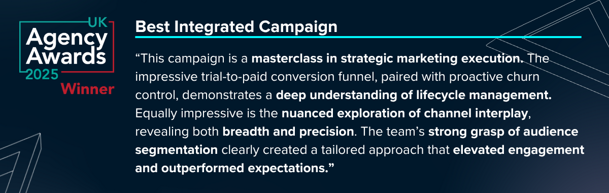
UK Agency Awards 2025
The Niche to Known campaign also won the UK Agency Award for Best Integrated Campaign. It was celebrated as an example of strategic marketing, highlighting its sophisticated grasp of lifecycle management and well-structured use of multiple channels, demonstrating both range and accuracy.
Feedback received from the judges:
Your Audience Is Waiting
As a performance-driven marketing agency, we help platforms like BFI Player grow audiences and drive conversions in an increasingly competitive digital landscape.
From shifting consumer behaviours to evolving media habits, we build scalable, full-funnel strategies that turn interest into sign-ups, and sign-ups into loyal subscribers. Whether you’re aiming to boost trials, reduce churn, or cut through the noise, we help you make every impression count.
Got a challenge on your hands? Let’s talk through it.
YoY Increase in Peak Months' Trials
Increase in Trial to Paid Conversion Rate
Conversion Rate Above Target
Arke’s deep understanding of our business drivers and challenges has delivered clear results over the past two years
generating double-digit growth across our core digital marketing KPIs.”
Senior Marketing Manager
BFI Player
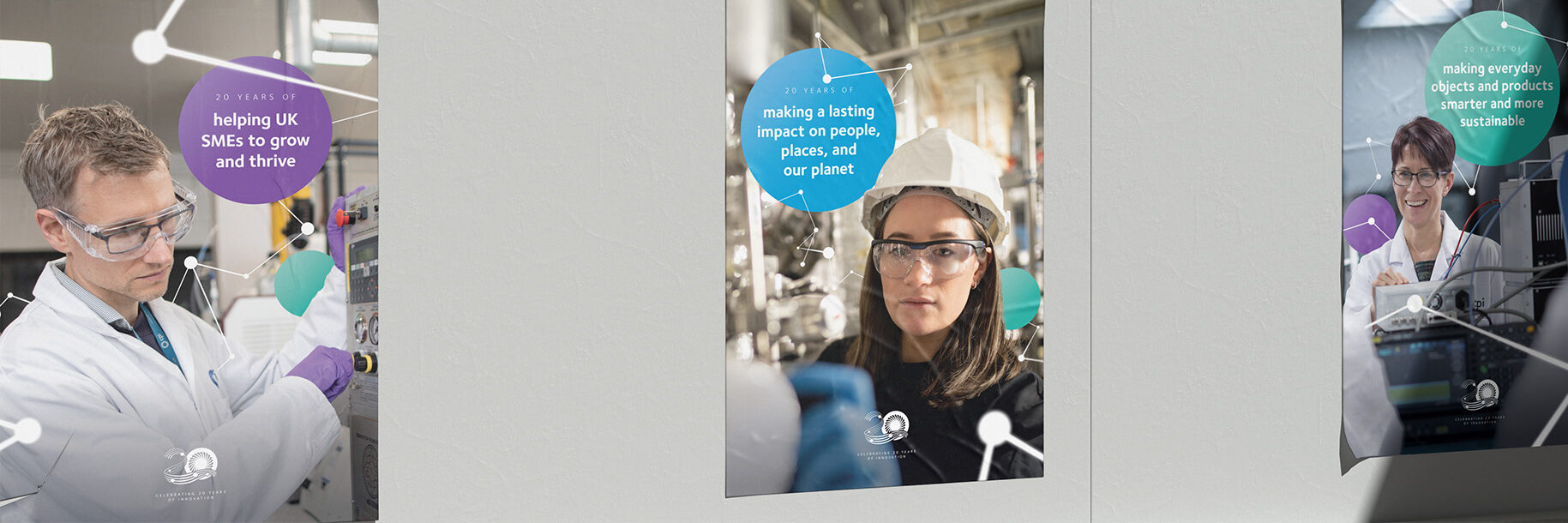
We delivered for CPI’s 20th anniversary
An immersive set of digital and physical assets to engage audiences and share the successes they achieved across their first twenty years of CPI’s history.

The Brief
CPI (Centre for Process Innovation) is a pioneering organisation at the forefront of innovation, driving advancements in various sectors through cutting-edge research and development. The social enterprise provides the equipment, labs, and expertise to scientists and businesses who are ready to take their work from the idea stage to the market, and everything in between.
To celebrate their 20th anniversary, CPI turned to Arke with a bold proposition: showcase CPI’s achievements across a range of different media. Our work together saw us creating a series of captivating case study animations highlighting their key milestones. The series of short, looping videos featured their top projects and achievements over the past 20 years, for display at trade shows and within the organisation’s numerous offices.
Showcasing innovation and growth
CPI had achieved so much in 20 years, and we were entrusted to find a way to cohesively and dynamically showcase their success for the screen in the form of the case study motion pieces.
Arke’s animated designs provided clear, straightforward demonstrations of CPI’s achievements over that period, effectively engaging viewers in a memorable way, making it not just a display of data but an experience in itself.

We hit the ground running working with CPI, pulling their milestone projects to the forefront
across a suite of complementary materials, both physical and digital – literally bringing innovation to life”
Matt Stokes
Arke’s Head of Creative
From animations to interactivity
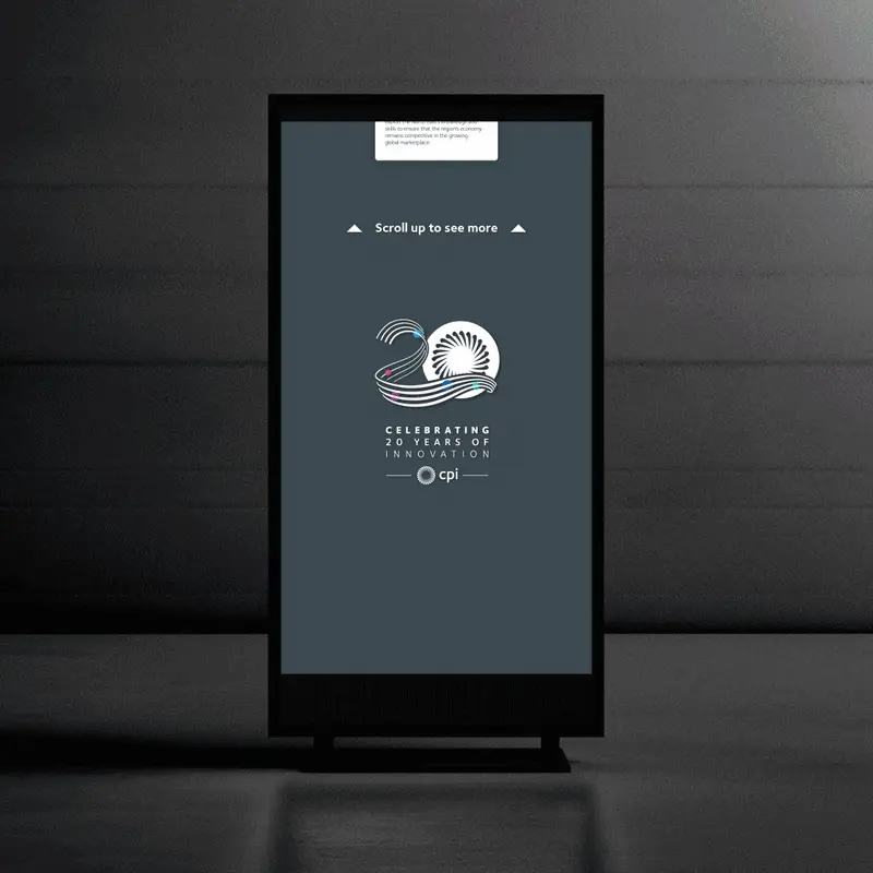
As well as the case study animations, Arke created a timeline for CPI’s 20th anniversary, an engaging, interactive experience being showcased at roadshows, expos, and networking events, highlighting CPI’s key milestones and achievements.
This immersive experience included tabs for deeper audience engagement, allowing users to browse through more content including videos and photo galleries.
A look for 20 years of success
We used CPI’s sleek palette of silver and white against a blue-grey gradient, accentuated by vibrant orbs to add visual interest and dimension. The swirling design of the 20th anniversary logo was incorporated to infuse a sense of movement and depth into the timeline, with curved lines being adopted to stand out from CPI’s regular angular linear compositions.
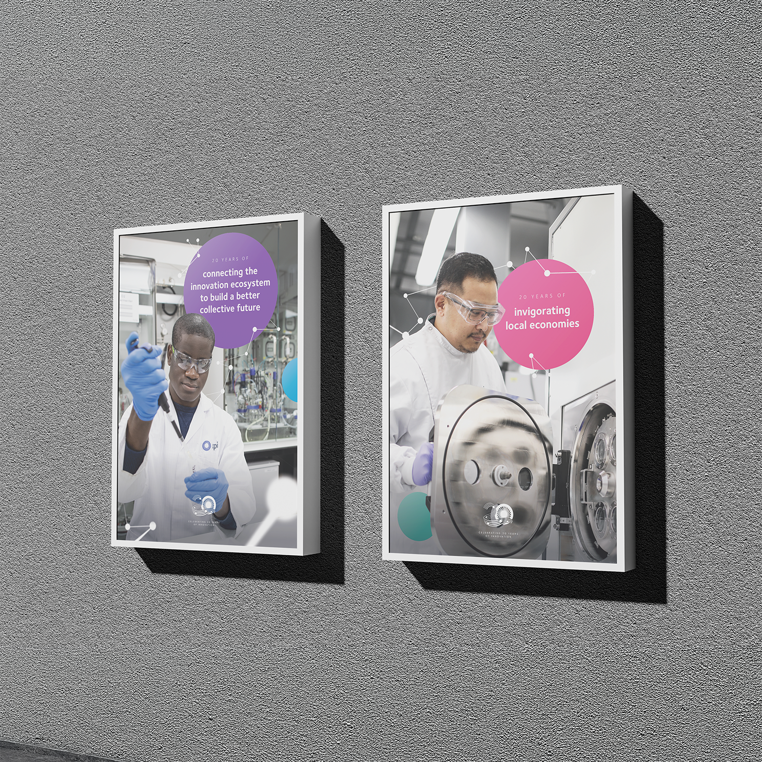

From digital to physical
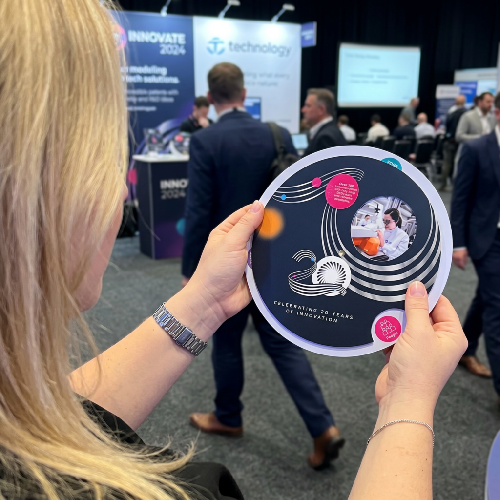
With an event fast approaching, we knew CPI needed something innovative for handouts, something that would stand out from the usual leaflets and truly celebrate their 20th-anniversary milestones. So we crafted a unique, engaging piece that would highlight their three core pillars: People, Places, and Planet, all on a spinning wheel, inspired by a planisphere.
Through several stages of conceptualisation, we honed in on a single, circular rotating wheel, which was both simple and versatile. This design allowed us to showcase CPI’s greatest achievements, aligned with their values, while maintaining a clean, modern look.
Our process saw us iteratively experimenting with elements to provide depth and focus, and choosing the perfect matte finish for a sleek, professional feel. To drive engagement further, we included a QR code linking directly to CPI’s 20th-anniversary landing page. The result was a dynamic, eye-catching piece that perfectly aligned with CPI’s brand and drew in the crowd.
This spinning wheel would accompany the digital timeline at roadshows, seamlessly bringing the multi-faceted creative project together and offering a cohesive, interactive experience that celebrated CPI’s 20-year journey.
Outcome: Celebrating 20 Years with Style

What began as an initial creative project evolved into a three-tier experience across different mediums.
We delivered a series of products that CPI was proud to showcase, that truly captured their journey and highlighted their many achievements. Our team transformed their impressive growth into engaging elements that captivated audiences at roadshows and expos.
We thrive on the collaboration with CPI’s inhouse team, syncing up with their vision and leveraging our expertise in design and interactivity. Together, we crafted a project that not only celebrated CPI’s rich history but also set the stage for its future innovations.
Check our creative services page for more insights into our projects and creative solutions.
Reflecting on 20 years of work was never going to be an easy task, but we are thrilled with the final projects.
We’re looking forward to seeing where the partnership takes us.”
Communications, Content & Channels Manager
CPI
impressions promoting short courses
impressions promoting exams
The Challenge
Having previously partnered on record-breaking campaigns, the London Academy of Music and Dramatic Art (LAMDA) reached out to the Arkenauts to support their dual objective campaign to promote both their HE and Short courses and Exams offerings.
We were tasked with:
– Effectively raise awareness of LAMDA’s HE and Short Courses
– Effectively raise awareness of LAMDA’s Exam offerings
– Increase the number of Exam providers and generate Exam bookings
As we helped to smash goals for LAMDA in our previous campaigns together, we knew this was a challenge we would excel in – creating the perfect multi-channel strategy to generate even more record-breaking results for another successful partnership.
The Strategy: how we began
Using our expertise in the industry, data built throughout previous campaigns and audience research, we knew it was essential to iron out the specific audiences we needed to target for each course campaign. As each objective had a slightly different target segment, we needed to adapt our strategies accordingly.
We conducted a detailed analysis for each online channel we wanted to use, suggesting the appropriate messaging, creative and call-to-actions that would excel on each platform. From here, we created a full-funnel media plan enabling us to take action at each stage of the conversion process to drive awareness and applications for their courses and exams.
We designed a diverse range of eye-catching creative templates for social media adverts, providing the creative team at LAMDA with reusable assets that could be refreshed in alignment with our campaign recommendations. This included guidance on crafting animated banners, utilising Photoshop files, and other relevant elements.
The creative team at LAMDA were then able to use these templates in-house to update assets accordingly in line with campaign progress.

Implementation
Revving up our Core Courses campaigns, we finely tuned targeting to captivate aspiring students aged 17-27 and their influential parents residing in the UK, particularly zeroing in on the South of England. This was due to our research informing us that this was the area with the highest demand for acting and drama degrees and training.
To execute a killer strategy for this audience, we harnessed the power of TikTok, Facebook, Instagram, Google Display, Google Discovery, and Google Search. This powerhouse combo aided us in nurturing potential students from initial exposure to LAMDA and their course offerings through to application.
Shifting gears to our Short Courses campaigns, we used targeting to resonate with potential students aged 18-34, and the parents or influencers of the 17-20 age group. But what made this campaign exciting was the ability to also work outside of the UK. We extended targeting to key US cities, including New York, Denver, Los Angeles, and Atlanta. This was due to these areas having high demand for LAMDA’s nature of training, as well as there being a few feeder schools for the university in these locations.
Here, we opted for a more streamlined strategy, gliding through Facebook, Instagram, Google Discovery, and Google Search. This focused approach wasn’t just about awareness – we honed in on generating mid/lower funnel outcomes (ad engagement, CTA button clicks, applications etc.,) as opposed to brand/course awareness.
Gearing Toward Professionals
For their exams offering, we needed to recalibrate our approach and steer our marketing towards educators and seasoned professionals who want to upskill and enhance the opportunities of students interested in the performing arts.
We diversified campaigns across YouTube & LinkedIn, focusing on top-of-funnel outcomes rather than driving immediate action amongst our target segments. With a visually compelling, video-first approach, these campaigns were optimised to reach our refined audiences at scale, while maintaining a cost-effective CPM (Cost-Per-Thousand-Impressions), and informing them of LAMDA’s exams offering.
Moving further down the funnel, we made use of Facebook & Instagram’s efficient interest-based targeting capabilities to drive both in-platform and on-site engagement, which would also support us in building data-driven retargeting pools to be used within our conversion-driven campaigns.
At the very bottom of the funnel, we leveraged Google Discovery and Google Search to drive high-intent action amongst our target audience. To do so, we employed the use of sophisticated remarketing audiences to re-engage those who may have interacted with one of our captivating ads further up the funnel or explored an exams page on the LAMDA website but did not convert.
At each stage of the campaign, we stayed in touch with LAMDA, shifting our budgets in response to the exams and courses that needed more attention. Due to our designed templates and expert guide, the in-house design team at LAMDA were able to quickly and efficiently provide us with up-to-date assets for each dynamic change in the campaign.
Results
HE and Short Courses
Across both campaigns, we captivated a staggering total of 4,676,767 electrifying impressions, sparking an impressive 48,432 clicks through to various course-specific landing pages. Our Click Through Rate (CTR) soared at an exhilarating 1.04%, all achieved at a Cost-Per-Click (CPC) of just £0.57. This achieved our goal of raising awareness of these courses by not only delivering so many eyeballs-on-ads through impressions but also a significant click-through for more information.
Exams
Across all campaigns, we showcased a total of 1,883,017 impressions, igniting 18,262 clicks through to various exam-specific landing pages. Achieving a magnetic Click Through Rate (CTR) of 0.97%, with a Cost-Per-Click (CPC) of just £0.70, ensuring an engaging and cost-effective journey for our audience.
More importantly, we delighted our client with our brand awareness efforts, which played a crucial role in generating applications and helping LAMDA hit its internal enrollment targets. We were also able to utilise the additional budget from this campaign to excel in LAMDA’s Clearing strategy, making the most of the budget we had to accelerate LAMDA’s enrolments.
impressions promoting short courses
impressions promoting exams
Arke has been a game-changer for us, creating impactful awareness campaigns and give our courses a powerful boost.
We’re updated regularly and feel confident taking their suggestions to level up our campaigns.”
Chief Marketing Officer,
LAMDA
Ticket sales increase vs targets
More tracked purchases than previous years results
More clicks vs targets
The Challenge
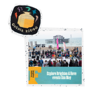
Kicking off the summer in May, Brighton comes alive with mesmerising art and entertainment around every corner thanks to Brighton Festival; an event that attracts thousands of visitors from across the UK and world to see world class acts in action.
In anticipation of Brighton’s most spectacular summer to date, we received an exciting invitation from the esteemed Brighton Dome & Brighton Festival. Their mission: reignite the fire of festivals to create brand engagement after the challenging years of Covid and sell out more shows than ever before.
Challenge accepted! We executed a comprehensive and impactful campaign, achieving resounding success in hitting our targets and delivering exceptional results, supporting Brighton Dome & Brighton Festival’s efforts to keep the spirit of Brighton alive and transforming the city into a vibrant hub of unforgettable events that ignited the summer in a true essence of what Brighton talent has to offer.
Our goals started with growing brand awareness and using the excitement around Brighton Festival we created to drive ticket sales for the Festival with the following KPIs:
1. Deliver 2.5M impressions, up 17% more from the previous year
2. 26,000 clicks to the website, 187% more from the previous year
3. A click through rate of 1.04%, 147% more from previous year
4. Sell 917 tickets to events within the festival, 627% more from previous year
The Strategy: how we began
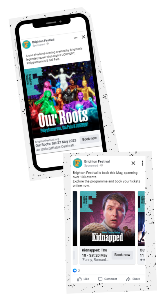
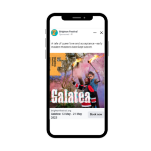
 Starting with spreading the word of Brighton Festival and all it had to offer, we began at the top of the marketing funnel with a brand level approach. This kicked off with a briefing call with Brighton Dome & Brighton Festival where we collaborated on all the eye catching graphics we could use to entice audiences and generate excitement for the event. The client took the brief by the horns, generating engaging creative we could leverage in our campaigns.
To begin this approach, we outlined the audiences to support the bespoke media plan our expert team had created, concentrating on people interested in events across Brighton and surrounding areas. To go alongside this, we strategically matched which platforms would engage this audience best, and where would be most beneficial to get the most out of the budget. We created a personalised data visualisation dashboard for Brighton Dome & Brighton Festival, allowing them to track campaign performance live throughout the campaign and for us to demonstrate our tactics as we redistributed budgets reactively. Then, it was time for a three-pronged brand awareness strategy to be launched.
In the first of our platform tactics, we utilised Youtube, serving 15 and 30 second ads using captivating videos teasing the different events and shows, leveraging targeting on the south of England and 10km of Brighton in order to attract those most likely to be able to commute to Brighton for the shows. Initially on Facebook and Instagram, we used a wider brand level targeting approach to target people who were interested in events and going to shows allowing the platforms to gather data and learn from the engaged audiences.
The Making of a Month to Remember
Due to Brighton Dome & Brighton Festival holding a not-for profit charity status, we were able to secure a Google Grant to utilise some free search advertising. We leveraged this to promote the festival at a brand level approach, as well as particular events and shows. Within the Ad Grant limitations, we used generic keywords with intent like ‘things to do in Brighton’, ‘events around Brighton’, ‘summer activities’ and ‘family days out’ alongside event specific keywords. Through Google Grants, we were able to secure just over £10,000 of free advertising to generate over 6k clicks, greatly contributing as a driver of revenue for the campaign.
 Having the brand awareness side conquered, we moved into consideration tactics. Using Google, we delivered search and display ads across our target audience of event fanatics and general fans of each of the acts. Google Search campaigns were split based upon both event-specific and more generic event keywords.
Keyword targeting was our superpower, which looked to reach and engage those who were actively searching for Brighton Festival terms or more broader ‘Events in Brighton’ terms. Also consistent with Google Display, Google Discovery was optimised heavily towards users on mobile devices, as this is where we saw the highest volume of clicks at the highest CTRs. We also noticed competitors bidding on our brand terms, so got into action early to compete with this.
Implementation
Moving onto high-intent tactics down the funnel to drive ticket sales and fill seats through Brighton Festival’s busy line-up, we took advantage of Meta’s detailed targeting capabilities, employing geo-based targeting tactics.
We used data from our previous brand level campaigns to develop a range of audiences to target, including those interested in events, look-alike audiences to ticket buyers and people with access to easy transport links into Brighton. Hyperfocusing on contextual targeting, we built out audiences to ensure we were only reaching high intent people. We targeted people who had been to an event or a band similar to acts within Brighton Festival, adding a kilometre radius on the time the gigs were happening, filling feeds with the creative and eye-catching graphics. In partnership with the client’s graphics, our creative team produced engaging and interactive copy to accompany ads, enticing prospects to Brighton.
 As our event-specific ads were fueled by particularly granular layered interest and geo-based targeting, ad relevance was maximised amongst our target segments, allowing a smooth transition from initial engagement through to conversion with ease. With so many acts, shows and events within the Brighton Festival, matching all of these to audiences was no small task and required hands-on work by the team in order to make sure each event was reaching potentially interested parties.
As we began to implement campaigns, we were met with promising results, and the client wanted to push more shows and utilise the budget. Due to showing how we could be reactive with budget, reallocating depending on popularity and seats sold, we were granted additional cash to push our results even further.
We were as agile as possible, keeping in constant communication with the client to recognise which shows were priorities for them and where we needed to push focus with high intent recall. Being reactive allowed us to take advantage of high-intent audiences, elevating the talent of Brighton Festival through engaging copywriting and striking graphics paired with targeting tactics to upscale campaigns.
Results
In only a short burst, we smashed targets, excelling even further with the additional budget granted to us, as well as utilising our Google Grant. Raising awareness early was a hugely important part of campaign success, and allowed us to create a foundation for conversion, skyrocketing numbers out of this world.
Through our ability to create precision targeting with flexible re-distribution across tactics we achieved:
1. 3,982,619 impressions, up 58% from our target
2. 42,439 clicks to the website, up 62.7% from target
3. 1.07% click-through rate, up 3% from target
4. 1,523 ticket sales, a 66% increase from our original target
5. 1095% more tracked purchases than previous years results
More importantly, due to our reactive decisions and optimisation, the client was super pleased with our work, and we are over the moon to continue our relationship with Brighton Dome & Brighton Festival going forward to implement GA4. As a Brighton based agency, it is invaluable to us to support our local community. We are incredibly proud to have had the chance to enjoy many of the shows ourselves and recognise all the effort Brighton Dome & Brighton Festival put into each event.
Ticket sales increase vs targets
More tracked purchases than previous years results
More clicks vs targets
Arke has been a true asset to Brighton Festival’s digital growth throughout the campaign.
The constant communication and recommendations to optimise our channels has been exemplary.”
Marketing Manager,
Brighton Festival
ROAS
ROAS for Santa Campaign
The Challenge
We love working with local businesses, so when Brighton i360, a tourist attraction with the best views in Brighton, got in touch to elevate their brand within and beyond the city, we jumped at the chance. With a mission to enhance brand awareness and drive ticket sales within their key target audience segments, we had just the plan to push targets to new heights.
We devised extensive audience research with creative approaches paired with a killer strategy to achieve the following goals:
1.Increase online ticket sales to 50% of total sales
2.Develop a distinctive creative concept with strong visual identity amongst key target audience segments
Approach
Brighton i360 wanted to primarily focus on driving ticket sales around young families, couples, and avid sightseers within Brighton and the surrounding areas. Our goal was to spotlight the attraction’s tailored experience, and we had just the strategy to realise this vision.
We delved into audience exploration, researching their pain points, desires and needs. Our copywriter ventured out into the city to gauge the communal sentiments towards the i360. His one-on-one interactions with local individuals, tourists and day-trippers on the vibrant streets of Brighton provided invaluable insights – a snapshot of public opinion that was essential to our strategy.
Using our expert experience in the attraction industry, we suggested a creative approach using paid media to reach potential adventure seekers and skyrocket i360 to success.
Creative Conceptualisation
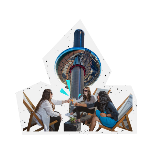
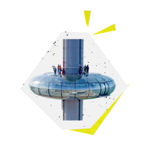
Through collaborative ideation, crafting creative concepts and moodboards, three distinct ideas emerged. The chosen concept reimagined the city’s essence from a new vantage point – ‘A Different Perspective’, encapsulating Brighton’s unique charm. Using the sky and clouds, playing on the fact that the i360 takes passengers on a journey 450ft into the clouds, morphed into different shapes that resonated with that audience, we captured the breathtaking views of Brighton and its wonderful, lifeful moments from an elevated standpoint. We focused concepts around each audience, such as, engagements for couples, a day out for families and an immersive experience with memories and unforgettable experiences for sightseers.
We also explored other ideas, including two based around augmented reality. Playing around with AR app possibilities and Snap’s AR glasses, we developed interactive ideas that would consume the customer with a fully integrated digital experience.
After presenting the concepts, the client agreed that ‘A Different Perspective’ hit their brief and wanted to explore this further for the paid media campaign.
Making the Media Mix
Recognising i360’s core identity and wide audience appeal, we proposed a video-focused strategy for maximum brand impact. We kicked off by storyboarding ads aligned with our creative concept, tailoring segments for each audience.
Working with a local production company, Be The Fox, we wasted no time in starting to shoot content for our campaign. Our conviction in the potency of video ads was strong, and a pivotal element of our creative direction was the film shoot itself. We hired actors and got into action, focusing on the themes of a magical day out for you and your family and tailored this to each audience within the film.
Using different actors for each audience segment, we highlighted the essence of each of their desires we found within our research, showcasing the i360 and the sights of Brighton it has to offer. With us as directors, their cameras rolled as we unveiled the story’s essence, optimising for various platforms by shooting in square and portrait formats. We highlighted classic Brighton themes that resonated with our audience during the research phase, such as ice creams and the beach, showcasing all the i360 had to offer. The result was a captivating two-minute advertisement, a fusion of imagination and possibility, family appeal, and the i360’s charm as a tourist attraction.
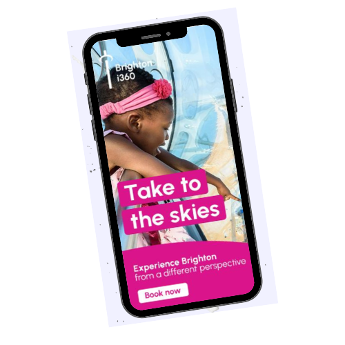
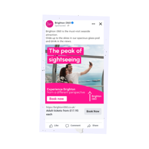
From this, the next step was the creation of the adverts to showcase the video. The messaging framework emerged, and we specifically focused on paid copy. Playfully centred on elevation, our language was vibrant, invoking sunsets and breath-taking views. The tagline “Wonder of the World” encapsulated our strategy, adapted for each audience segment.
Launch and Measure
For the launch of our media campaign, the first step was to raise awareness of i360 among the target audience. For this, we led a video-first approach, using Snapchat and TikTok as our amplifiers. The campaign primarily targeted three distinct, non-overlapping audiences, ranging from a hyper-local demographic to those on the outskirts of North London. For engagement, we devised concise Snap and TikTok clips extracted from the initial video. These snippets captured the excitement of couples, families, and sightseers as they anticipated their i360 experience. The initial emphasis was on video for heightened awareness, allowing us to establish video viewer retargeting audiences without relying on third-party cookies.
Moving down the funnel, we generated intent with search and meta. Navigating search proved to be a highly competitive space, contending with formidable local attractions and third-party ticket vendors for i360, including large companies with substantial budgets. However, we identified a strategic gap – our competitors focused heavily on bidding for their own brand terms. To ensure conversions were truly incremental, we orchestrated a significant shift in spending. Our approach pivoted toward broader, generic terms such as “experiences in Brighton,” “family days out,” and “things to do,” thereby enhancing our conversion tactics.
To amplify our efforts, we implemented retargeting strategies across Facebook, Instagram, and Google Display. This involved honing in on individuals who had exhibited high engagement with our videos during the awareness phase. Additionally, we targeted site visitors who hadn’t made a purchase within the preceding 90 days, ensuring a focused re-engagement approach. We also set our sights on those who initiated the checkout process but didn’t complete their purchase, aiming to rekindle their interest and steer them toward conversion.
Seeing the initial success of the campaign, Brighton i360 allowed us to expand its scope, focusing on the ‘adventurer sightseers’ audience. Originally launched as an awareness campaign, the campaign’s impressive performance indicated the opportunity for growth and led us to further enhance and develop the “Extreme 360” attraction within i360 when it first launched.
Results
With our boundless creative energy and elevating strategy, we propelled i360 to unprecedented heights of success with a +603% ROAS – a great result for a short campaign in a competitive industry. The campaign yielded remarkable results, culminating in revenue reaching almost a quarter of a million (£225,992.07) – with an impressive average order value of £46.53. This was complemented by a total of 4,857 transactions, a testament to the campaign’s efficacy in driving engagement and conversions.
Due to the success of the campaign, we were also tasked with amplifying its brand further. We crafted a campaign to ensure its appeal as a summer attraction extended seamlessly into the winter months through a captivating Christmas Santa campaign.
By adeptly tailoring our strategy to the changing seasons, we continued to draw in visitors during the festive season. The Santa campaign proved to be a resounding success, achieving an exceptional Return on Ad Spend (ROAS) of +994%. This accomplishment underscored our ability to pivot and engage audiences across different contexts, further solidifying i360’s position as a dynamic and year-round destination.
ROAS
ROAS for Santa Campaign
Here at Arke, we’re big on community, so it’s important to us that we give back to our local areas. Regularly taking on passion projects, we were delighted to work with Allsorts Youth Project supporting their mission of listening to, connecting & supporting children & young people under 26 who are lesbian, gay, bisexual, trans or exploring their sexual orientation and/or gender identity (LGBT+) and their families.
So, when we were asked to redesign their training slides in order to support their message and help create some fresh content and assets that showcase the incredible work that they do, we jumped at the opportunity.
The challenge
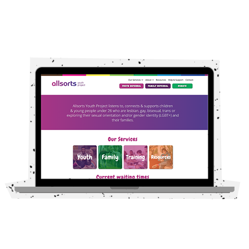
Allsorts Youth Project is an LGBT youth charity in East Sussex. The project aims to meet the needs of lesbian, gay, bisexual, trans and unsure youth in Brighton and Hove and the wider East Sussex area.
With this in mind, Allsorts tasked us with the responsibility of redesigning their entire training material that would be used to inform businesses and enterprises around East Sussex on inclusivity best practice in the workplace.
It was important for us to create a sense of professionalism within the slides whilst also bringing the fun and personal essence Allsorts has to amplify the motivations and pride within the brand.
Our main aims were to:
1. Make the slides a visually appealing & enhancing learning experience.
2. Look professional, slick, bold, to appeal to the consumer and business audiences.
3. Still represent Allsorts key brand essence, its values and services.
How did we go about this?
In order to create slides that were professional yet still captured the essence of Allsorts we had to think outside of the box.
For the first step of the research phase, it was incredibly important for our company to receive the educational training Allsorts provides, to better ourselves as a business and ensure inclusivity throughout our internal and external communications.
The training delivered by Allsorts allowed us to immerse ourselves in the experience of prospective companies that would be receiving the slides. This allowed us to truly understand how important the training is and how we could ensure all of the content resonated in the audience’s mind.

From here, we developed a range of ideas based on a Pinterest board Allsorts presented to us to discover shapes, colours and imagery that truly reflected the clients passion and dedication to the Youth Project cause. From this, we then developed three different mood boards featuring a variety of aspects that Allsorts had favoured, and in turn gave each one its unique stylistic approach.

Although Allsorts desired to go with a professional proposition, we didn’t want to lose what they stood for within the design, so decided to include a ‘wildcard’ concept that embraced abstract shapes and eye-catching colours – something we feel represented being proud of who you are, an asset Allsorts so effortlessly teaches to others.
Conducting regular check-ins with the client, we monitored feedback throughout and enhanced each of the three approaches to match. We explained to Allsorts our aim to keep the message of embracing who you are alive within the slides, without having to tone down their proud, aspirational and significant objectives as a company within a more corporate design. The client put their trust in us and we went forward with the concept that shouted Allsorts from the rooftops.
Our approach to design
We wanted the main focus of the design to be the incredible training Allsorts delivers. It was important for both us and the client to create content that enhanced Allsorts messaging whilst remaining eye-catching and engaging to the receiver.
We began by researching image banks to depict a collection of LGBTQ+ friendly images that did not appear too generic or out of touch, but yet aligned with what Allsorts stood for. From here, we collated imagery that represented LGBTQ+ communities from a wide range of backgrounds, yet highlighted Allsorts work with youth across Sussex.
We originated ideas from what it truly means to be different, focusing on curvature within the design to emphasise not staying on one path, embodying non-binary directions. Embracing a mix of pastel colours that aligned with Allsorts logo, we focused on using shapes and overlays to create depth and dimension amongst the slides. We placed these on the borders of slides, using them to utilise white space.
We paired this with sketchbook-esk doodles, based on the idea that they encapsulate the heart of the people the charity helps. Although the topic is series, each person has their own story to tell, portrayed through interactive, seemingly hand drawn doodles you may find in a diary/sketchbook. The doodles interacted with the shapes, adding the essence of fun to the graphics, without going overly youthful.
We developed these shapes to enhance text and statements within the training, focusing the trainee’s eye on important messaging to ensure all educational content could be clearly understood.
As the shapes began to take formality within the slides, we started to harness the collaboration of imagery. Placing the images in unison with the shapes, we evolved the images by including them within the shapes using masks and overlays, combined with the sketched doodles to ensure all assets flowed throughout the presentation.

Results
We were delighted that Allsorts were incredibly happy with the slides created and are now using them to train businesses across the county on inclusive behaviour within the workplace.
So far the slides have been shown to 11 businesses and the charity expects to deliver further training to 52 businesses this year – that’s a whole lot of eyes on these slides and we couldn’t be more proud!
Due to the relationship forged with Allsorts, we are proud to be supporting them with the next stage of their journey, creating a mix of video content featuring important messages from alumni, users of their service and staff. The content will go live over Pride weekend, and we are now thinking of ways to ensure this celebrates Allsorts and what they stand for as much as possible.
We are incredibly happy with the work Arke has done on our training presentations.
It is truly invigorating to have our content displayed in a professional yet refreshing manner”
Allsorts Youth Project
ROAS
YoY on booking targets
Impressions. Exceeded target by 8%
The Challenge
In the face of fierce competition from market giants, Joint, provider of premium student accommodation, entrusted us with an exhilarating mission: to amplify their brand presence in newly entered cities following a rebrand. With unwavering determination, we defied all odds and triumphed within a mere three months, not only surpassing brand awareness targets but also unleashing an unparalleled wave of conversions that shattered records.
With the beginning objective to grow brand awareness, we were set the following targets:
Earn 3.2 million impressions across target locations
Generate 1,394 enquiries from students looking to book rooms
Produce a 2000% ROAS
Attribute 60% of leads to our paid media strategy
The Strategy: where we began
Did you know that 60% of the student accommodation industry is dominated by only ten operators? For a young, emerging student accommodation provider looking to offer something new to the market in the form of luxury living and a focus on student support, it was time to break the mould in order to stand out.
With 2.2 million UK full-time university students and anticipating 17k new beds in 2023, it was time for us to disrupt the market to get Joints name out there following its rebrand.
Previously Big Student House, Joint needed a new website to match their rebrand and to showcase their unique offering. So, we developed a shiny new website, prioritising the user experience (UX) journey, combating previously complex updates to make it an easy and smooth process to make changes. As well as this, we introduced a ‘tenant tab’ section on the website to accurately represent Joint’s core values, optimising the overall site experience and to help improve ad quality score for the next step of the project. Not only this, but the new section also enabled Joint to be able to really connect with their tenants, providing a wide breadth of support from mental health to even meal plans!
 Once the brand spanking new website was live and showcasing Joint’s exceptional portfolio of rooms, we started to map out individual student journeys and customised landing pages with precise tracking mechanisms. This seamless connection of ads, landing pages, and property information catered tospecific needs.
But we knew it was super important for us to make Joint stand out from the crowd. To do this, we took a research-led approach and found through cross-city analysis of the housing market that ads took a uniform approach that are lifeless, uninspiring and not personalised. Using our power as a full service agency, we wanted to turn advertising on its head – and did just that.
We used Joints previously created characters and gave them life with carefully curated messaging frameworks. Injecting the personalities into properties, we evolved characters into a story within the journey. Once clicking on an ad, the respective character would take the student on a journey through the website, honing in on Joint’s presence for their tenants in all aspects of student life.
The Strategy: in action
Once we had foundation in the website and creative assets, it was time to launch our strategy across advertising real estate. Utilising TikTok, Snapchat, Facebook, and Instagram, we found students amongst their favourite platforms, effectively reaching Joint’s operating cities, engaging precise audiences. As paid media experts, we strategically set ourselves apart from the crowd, tactically bidding to enhance our presence near campuses, connecting with first and second-year students through Display and Search ads.
But we didn’t stop there, we wanted to level up even further. In a novel approach, our broader UK strategy engaged individuals who were in, regularly in, or who’ve shown interest in the target locations. Utilising one of the Google Ads location targeting options with people in or regularly in Joint’s target locations. Diving into the luxury of layered interest targeting, we focussed on identifying students who were in their first or second years of university who were actively in the market for student accommodation or researching suitable places to live. Not only this but we targeted people actively searching for Joints target city locations.
 We retargeted people who browsed property page views but had not yet submitted booking with evergreen content highlighting our freshly created tenant tab. We flourished the content with local tenant discounts, tenant well being support and living tips, keeping students actively engaged throughout their entire journey with us.
Always staying ahead of the curve, we simultaneously used radius targeting of each city to ensure a broad geographical reach with the caveat that prospects around the country will have also been researching each of these cities, in addition to the highly segmented search queries that qualified them for student accommodation.
We added all countries apart from the UK as negative geographical targets to ensure that, whilst prospects are interested in The Joint’s operating locations, they were always UK-based. This allows us to reach students who were already studying in our target locations, but also further afield who were planning a move and looking for student accommodation.
Implementation
In just three months, we sky-rocketed our expectations and hit our targets early! Experts in optimising budget, we shifted our main objectives to a conversion led approach, always aiming to get the most for our clients with the money they have. With brand awareness conquered, we were ready to smash the campaign out of the park, focusing on optimising conversion rates and increasing revenue from bookings.
To further engage students we went beyond visuals, using the characters to reflect student lifestyle around seasonality and relevancy. For example, in winter, we honed in ‘staying snug’ and well-being due to depression levels being higher in winter. Keeping the key focus on properties, we overlaid characters within the houses, showcasing the high quality rooms whilst bringing personality throughout.
With our strategic hats on, we optimised cost per enquiry and revenue through data-driven lower-funnel tactics, reducing social media budgets where we had already mastered our audience. To compete with the bulky competition in the housing market, we increased search ad budgets to revolutionise our approach.
How you ask? Data driven thinking. Integrating HubSpot for real time data sharing, our expert team informed business strategies and optimised bids to students most likely to take action. Understanding the importance of using data to inform decision making, our team was incredibly reactive, allocating budget as and when rooms were booked. This meant we never missed a step, ensuring we were consistently ahead of the curve to get the most out of Joint’s budget.
However the journey wasn’t over just yet. Budget allocation considered available properties, rooms, and competitor activity, meaning we were always on the ball for what we had to prioritise next. Constant communication between our teams and the client allowed us to influence the student journey to be as seamless as possible, capturing high intent audiences right where we needed them.
Results
Using just 61% of our media budget to date, we have shattered expectations, with a mind-blowing 3,875% return on ad spend (ROAS) for the campaign. With bookings soaring 40% YoY, the client is now poised to launch 12 new properties across 2 additional cities, 4 months ahead of schedule.
We achieved:
4.9 million impressions (exceeded target by 8%)
18.2k clicks
£0.34 CPC
0.37% CTR
82% of leads attributed to Paid Media in Q1 (22% above target)
40% up YOY on booking targets
3875% ROAS using only 61% of the paid media budget
The agile budget redistribution across channels enabled us to maximise conversion outcomes and exceed all expectations. More than this, our relationship with Joint has never been stronger, and future plans together never brighter – taking on fun, new advertising initiatives – so watch this space.
ROAS
YoY on booking targets
Impressions. Exceeded target by 8%
We love how Arke approached us with a new campaign concept and creative that fits into our wider brand goals.
The strategic support in achieving our objectives is incredible.”
Managing Director,
Joint Living
ROAS
Revenue from all sources
Paid Media revenue increase
New customer site visits
THE CHALLENGE
As an e-commerce brand, luxury fragrance company Shay & Blue’s goal was to build a new engaged audience for their email marketing activity over the key sales period, Black Friday. But, as a strategic agency, we wanted to elevate this – building up everlasting data-driven targeting lists.
We devised objectives to boost their mailing list, while making Black Friday their best sales period ever:
-
- Increase new customer visits by 30% YoY
- Increase ROAS by 100% YoY
- Decrease cost per acquisition by 50% YoY
- Increase number of transactions by 150% YoY
- Increase revenue by 150% YoY
THE STRATEGY
The award-winning strategy was possible through the collaboration of each team member bringing their expertise together. A fully integrated campaign through the power of teamwork.
Our approach was two-pronged: lead generation and conversion. With a robust understanding of the market, and Shay & Blue’s wider business goals, our strategy was to:
-
- Build up quality data, preparing for high levels of competition
- Build trust with the brand, boosting awareness in a saturated market
- Amplify branding, increasing recall while bringing something fresh to market
- Test and learn to understand the consumer’s appetite
LEAD GENERATION
Shay & Blue pioneer accessibility and individuality. Their 18-26-year-old target audience is ‘rebellious in nature, wanting more fun, more choice and more conscious.’ Award-winning work is built with the audience in mind, and that’s exactly what we did. It was important we elected the rebellious nature throughout the ad, appealing to Shay and Blue’s consumers.
The first tactic was lead generation. After careful consideration and collaboration, the team wanted to convey a playful and exciting campaign that would generate exceptional results, and we had just the idea. We pitched that Shay & Blue offer a free 10ml Blood Oranges fragrance around Halloween to build trust between brand and audience. As 68% of Shay & Blue’s sales come from repeat business, getting the product into the consumer’s hands was vital.
Broad targeting and layered interest tactics maximised budget while attracting those with an affinity with the brand’s promises. From this, we built up Shay & Blue’s data and mailing list, facilitating precise targeting through lookalike audiences.
PAID MEDIA
In the spirit of joint team effort, our Paid Media team crafted a paid media plan for maximum flexibility before Black Friday, testing and focusing budget on historically best-performing channels, using prior campaign and audience learnings into overdrive to maximise sales. We focused on small budgets on Facebook, Instagram and TikTok, utilising a range of creative static image ads, lightweight motion ads, video ads, and dynamic product ads to showcase the product and offer.
We activated a second burst of lead generation in the week before Black Friday. We built upon the data already collected, gaining foresight into the thirst for the products before Black Friday.

On Black Friday, we targeted lookalike audiences using data collected through lead generation and the client’s CRM data, alongside layered interest audiences to drill down into niche beauty and fragrance audiences with an affinity for affordable and ethical, yet luxury products.
IMPLEMENTATION
Our messaging framework played on horror movie tropes, combining engaging copywriting, emphasising deals and price-slashing. This helped us to contend with the rising cost of living and competition.
Shay & Blue refresh their aesthetic seasonally, and the brand evolves accordingly. We produced a creative that screamed Shay & Blue from the rooftops, with the design complimenting their autumn aesthetic, ‘Own The Night’.
Our fantastic creative team embodied Halloween and turned their Blood Oranges fragrance into Bloody Oranges; they loved it – they even decided to use it across their web campaign!
We split-tested creative and pushed the boundaries of the brand to stand out on social, where we knew competition would be fierce. Our abundance of creative distinguished us; we retargeted people with fresh ads, increasing brand awareness whilst avoiding ad fatigue.
The Black Friday adverts emphasised the urgency with our copy – “Going, going, gone!”. Copy is limited on social, so we spearheaded creative design to convey the extent of the deal alongside urgency.
RESULTS
With a 1009% ROAS, the campaign resulted in a record-breaking period of online trading for Shay & Blue, revenue attributed to Paid Media increased by 244.59%, generating their biggest month in online revenue in a single week – a huge impact for a small, niche brand.
We also saw high levels of engagement among younger audiences, who left comments on social media. New customer site visits increased by 49.23% and revenue from all sources increased by 159% YoY.
Vital to success, we integrated the campaign into all owned media; first touchpoint to website. Our foreplanning, strategy and execution increased awareness of the niche brand, while competing with major labels and retailers.
Shay & Blue view us as their strategic partner – the direction we plan to develop with more clients this year. The sweet scent of success!
Ready to achieve your eCommerce goals? Let’s talk.
ROAS
Revenue from all sources
Paid Media revenue increase
New customer site visits
The way Arke has driven and managed this campaign, alongside the results, is exemplary.
Arke has given us the confidence to let them lead the way on our future campaigns”
Managing Director,
Shay & Blue
Increase in conversions
Increase in transactions
The challenge
In the build up to Black Friday, leading luxury fragrance company Shay and Blue wanted to increase their mailing list to enhance their targeting pool (and capabilities) in the lead up to the big day.
Shay and Blue have a loyal customer base with high retention rates, as a result of their excellent customer service and their eclectic mix of fabulous, planet friendly fragrances. As such, they required a campaign that would encourage new customers to sign up to their mailing list so they could build up their invaluable database for retargeting in subsequent campaigns.
To help Shay and Blue with their marketing and sales strategy amid this crucial period in the e-commerce calendar, our Paid Media and Creative teams came together to strategise an innovative campaign that would:
-
- Attract and engage new customers to build their database
-
- Remind existing customers of their brand and their products
-
- Increase brand awareness and sales around this key sales period
The strategy
Our Paid Media and Creative teams devised a full-service approach that would connect the dots and create a seamless experience between Shay and Blue’s adverts and their website; while creating something that caught their audience’s attention. We took advantage of the season – Halloween – to add a spooky spin on Shay and Blue’s pre-existing adverts.
We developed an awareness campaign across Google Display, Facebook, Instagram and TikTok that would turn Shay and Blue’s signature Blood Oranges fragrance into a seasonal version perfect for the time of year, resulting in ‘Bloody Oranges’!
The campaign saw Shay and Blue offer a free 10ml version of their scent (typically £25) – customers just had to pay for shipping.
Shay and Blue’s target audience were served the ads on social media. Once clicked, they were taken to a Halloween landing page on Shay and Blue’s website where they would complete their transaction.
The strategy continued
Our copywriting team worked closely alongside our designers and paid media experts to craft copy that was topical, playful and enticing both within the design of the ad, the headline and the supporting copy. ‘Slash through the sales’, ‘A devilish deal, just for you’ and ‘Frighteningly free fragrance’ are examples of these.
‘At Arke, we take the time to research our client and the strategic aims of the campaign that feed into their wider goals. As such, we aligned the copy with Shay and Blue’s value proposition from product family, to product, to emotional value. This was evident throughout the campaign, from initial response to the advert to their experience when on the website.’
– Jacob Lowery, Copy and Content Executive at Arke
Our creative process was no different; we leaned into Shay and Blue’s branding – crisp, clean lines and their signature colours. However, we were given the creative license to intensify their branding for the season. We used bright, impactful colours to transform their always-on ads into refreshed Halloween versions. This helped to create excitement around the product.
In order to increase the number of contacts and customer data for Shay and Blue, customers were asked to submit their phone numbers and email address when checking out. After this, they were sent a Whatsapp message and email confirming their purchase.
The purpose of this was to keep Shay and Blue top-of-mind among their target audience as they moved towards Black Friday. It would also provide multiple platforms of targeting to feed into the cross-channel approach we have planned, as well as a direct channel for customer service, improving the overall buyer experience.
Data capture and customer experience
This provided Shay and Blue with an opportunity to follow up with customers and their orders via email and text, enhancing the customer service experience.
Having worked with Shay and Blue on various campaigns throughout the year, we understood their audience, their aims and how to achieve them. As such, our team pulled together a short-burst strategic campaign for Halloween, aware of the challenges that a tight turnaround, a change of creative, and the duration of the campaign (just three days long) would present. However, we planned this campaign with Shay and Blue’s wider objectives in mind.
Despite these factors, we turned around the adverts within two weeks and adapted Shay and Blue’s current creative to reflect seasonal trends. We directed customers to bespoke forms on the brand’s website to ensure Shay and Blue were able to accurately capture user information once people moved from advert to website.
Results
This campaign was highly effective, and the offer was popular among Shay and Blue’s target consumer, particularly on Facebook and Instagram. It also had a wider impact, positively affecting overall sales on the website.
From this campaign alone, Shay and Blue increased their conversions by 470%, leading to a total of 585 product sales during this campaign. They also experienced a 470% increase in transactions – providing a larger customer database for subsequent retargeting campaigns, such as during Black Friday.
Increase in conversions
Increase in transactions
The way Arke has driven and managed this campaign, alongside the results, is exemplary.
Arke has given us the confidence to let them lead the way on our future campaigns”
Managing Director,
Shay & Blue
The Challenge
UCA underwent a digital transformation project throughout 2019, which was fully supported by a new recruitment campaign concept, designed to inspire, engage and convert students throughout their journey into Summer 2020.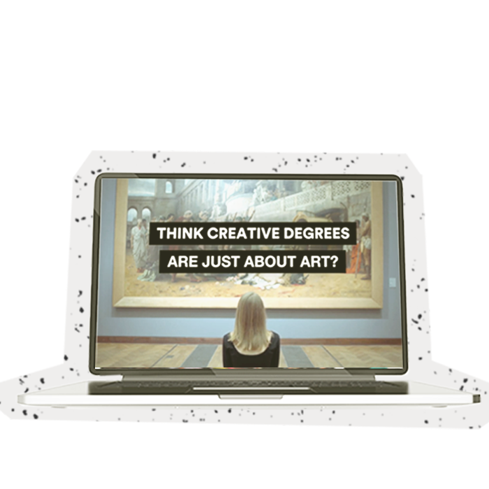
Plateaued UK undergraduate numbers within the creative arts subjects, circa 125,000 per annum
To challenge perceptions & attitudes that creative degrees are only for ‘art types’ whilst, raising awareness of the ‘need for creative thinkers & doers’ across all industries
Develop a campaign concept which accelerates the institution towards their domestic & international student recruitment objectives, for 2020 intakes
The Solution
Produced the THINK AGAIN! recruitment campaign concept & accompanying concept guidelines to cover all digital, social & print channels
Produced custom typography, messaging & digital assets (video, animations, banners, social stories etc.) to allow story-telling throughout the 4 stages of the student recruitment cycle
Put forward a custom content toolkit to allow UCA to develop content further in-house, whilst adhering to all appropriate concept formats & specifications, for various video, social, outdoor & print environments
Results
This campaign left all higher education benchmarks behind, obtaining CTRs of over 120% vs the industry averages, reducing Google’s CPCs by 53% and Instagram’s Cost per Impression down by 76%. With 50,000 students and their families engaging with the content 160,000 times.
Arke aren’t like other agencies I’ve worked with before,
they’re refreshing.”
Marketing Manager,
University for the Creative Arts
The Challenge
Arke was appointed creative partners to King’s College London in 2019, providing ongoing creative marketing solutions to its various central and faculty departments, under their 5-year framework. In early 2020 lockdown, The Entrepreneurship Institute tasked Arke with re-imagining and producing a visual identity for the next annual edition of the Start! Magazine, seen by its students, alumni, stakeholders and partners all across the world.
Increase in the magazine’s relevancy and readership on campus, whilst reaching and engaging with new audiences
Inspire the future generations that entrepreneurial thinking is universal, a skill that is beneficial to their career trajectory.
Create an art direction that is suited and designed for its intended audience, that’s stimulating and consistent whilst moving away from its current corporate report style.
Build the statue of King’s Entrepreneurship, portraying its heritage, large network of alumni, annual programmes and events, and their ability to host world class-speakers to educate & upskill the audience.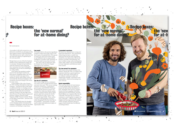
The Solution
We produced a contemporary magazine that revitalises the Entrepreneurship’s accomplishments and reputable status. The magazine pays deeper homage to Entrepreneurship’s roots of being a place to express, learn, and make a change.
In order to showcase the quality of storytelling and editorial art, Arke designed a flexible framework/typographical grid for the magazine’s layout, allowing articles of widely varying lengths from long-form news articles to short one-page articles.
The redesign is type-driven in the news sections, with dedicated art-focused pages to help keep the content and pacing fresh for the reader. This will keep a stance on the consistency of further issues to come. Illustration and photography are thoughtfully commissioned, and art directed throughout the publication.
What’s Next?
Due to COVID-19, we are now digitising the magazine enabling King’s to showcase their content and are introducing interactivity through animation. The digital magazine will be optimised for digital environments, giving it the ability to stand out against the noise of the social feeds.
This new magazine style has led the institute to explore their branding and we are excited to reveal that we are leading the re-brand journey with them! Stay tuned!
I love it, I love it, I love it. It’s mouth-wateringly good content.
It’s fabulous, thank you so much.”
Director, Entrepreneurship Institute,
King’s College London
Longer average website session
Lower bounce rate
The Challenge
We’ve worked with Magus Wealth, the Financial Planning and Wealth Management business, since 2021 to support them with a range of services, from launching their website to an entire creative and brand refresh.
Magus Wealth approached us because they wanted a full-service agency that could:
Identify core business objectives and how the marketing objectives feed into Magus’ ambition
Provide marketing strategy across their brand, with strategic solutions to attract, engage and convert core audience groups throughout the financial year
Rebrand Magus Private Wealth to align messaging, company position and brand outputs to multiple audiences, creating a consistent brand presence
Plan, develop and launch a new website to improve the user experience and drive engagement of their services
Generate consistent leads through strategic marketing activities
Implement and optimise tracking capabilities across all Magus sites
So, how did we get on? Here’s a rewind of the work we’ve done so far for Magus, and what we plan to achieve for them in the future.
The Strategy
Creative highlight: Guide to Financial Planning, November 2021
Financial Planning is a journey that spans an entire lifetime, focussing on where you are now and where you want to be – it’s a road map. Creating this guide was core to the Magus service offering.
Real-life iconography sets this guide apart from the competition. It’s an easy-to-read guide, following a carefully curated grid design, peppered throughout with images of real people in situations that readers can identify with. 
‘Arke did such a great job bringing our vision to life on this – I love the simple, easy-to-read layout and the lovely imagery. It has proved popular with clients and prospects! ‘ – Emma Taylor, Head of Marketing and Communications.
Digital highlight: Website launch, December 2021
We’ve transformed Magus’ website into an architecturally beautiful masterpiece, facilitating the user experience and keeping people on their site for longer.
Clear Calls to Action, menus and fast load times were key to decreasing Magus’ bounce rate. In fact, we’ve reduced the bounce rate on Magus’ website by 5.37%, and now people stay on the website for 13.39% longer.
From wireframes to a user-centric design and structurally sound coding, we’ve made Magus Wealth’s website easy to use and even easier to direct potential clients to conversion.
We also optimised the site for mobile, increasing the user experience and therefore encouraging people to stay on site longer. Before this creative refresh, only 31% of users were accessing the site on mobile devices, but now 52% use mobile devices. That’s an increase of 82% in mobile users, a testament to an optimised user experience.
Strategy highlight: Brand Guidelines, September 2022
What is a brand without brand guidelines? Our creative and marketing teams pulled together to produce a guide for all Magus collateral. In doing so, we sought to upskill Magus’ internal teams, providing them with a resource that could be used for years to come.
Brand guidelines form part of a wider brand strategy, creating a consistent, coherent brand image across media. Whether someone is looking at Magus’ social media, their website or their physical brochures, they’ll instantly recognise the brand because these guidelines create uniformity and increase brand recall.
Creative highlight: Pitchbook, September 2022
We created the holy grail document of the finance world; The Magus pitchbook. Making Magus’ pitchbook stand out, showcasing their services, portfolio performance, values and how they meet clients’ needs was no easy feat.
Primarily for use by the Magus Financial Planners, it’s a slide deck that can be tailored to each individual client’s requirements – the Planners simply pick and choose the relevant slides for their client meeting. These slides are key, and can be found on Magus’ most used documents.
Creative highlight: Welcome to Magus, September 2022
Welcome to Magus is an imperative asset for the business; a brochure that the brand can hand out to prospective clients to encourage a new partnership. This brochure was created to announce Magus’ brand relaunch and is an essential document in the new client onboarding process.
This document offers a more holistic and service-specific look at Magus – their values and their offerings. Within our design, we emphasised the heritage, experience and accreditations, key factors clients consider when choosing a Financial Planning and Wealth Management firm.
Mike Aitken, Magus Wealth’s Founder and Chairman, was thrilled with the Welcome to Magus brochure, stating, ’I’ve never been prouder to hand out a brochure – it’s perfect. Arke has taken our brief and run with it, producing a piece of art that I just want to hand out to everyone – prospective client or not!’
Results
We fully rebranded Magus Private Wealth to Magus Wealth across their media, from their website to their physical collateral, tone of voice, logo and even their colour palette.
We launched a full website enhanced for optimum user experience and in line with Magus Wealth’s KPIs.
We implemented GA4 – migrating Magus Wealth’s previous Universal Analytics setup too.
What else?
While we’ve highlighted some of our work for Magus, it’s just a fraction of the work we’ve done with them. Throughout our partnership, we’ve also created guides and assets for other collateral. This has included collateral for emails, blogs, business cards and social media banners.
We’re so pleased that Magus chose us as their full marketing partner, helping to create a coherent brand image across their platforms. Now we’ve built Magus a brand they’re delighted to show clients and prospects; we’re looking forward to increasing Magus’ client base through even more creative and digital work and marketing strategies.
What’s next for our partnership?
Magus has since expressed their interest in continuing their partnership with us, and we’re looking forward to working on an exciting digital project for them in the near future – keep your eyes peeled for the updates!
Longer average website session
Lower bounce rate
I’ve never been prouder to hand out a brochure – it’s perfect. Arke has taken our brief and run with it,
producing a piece of art that I just want to hand out to everyone – prospective client or not!”
Founder and Chairman,
Magus Wealth