The Money Charity
Full Rebrand & Brand System Development
CASE STUDY
We delivered for The Money Charity
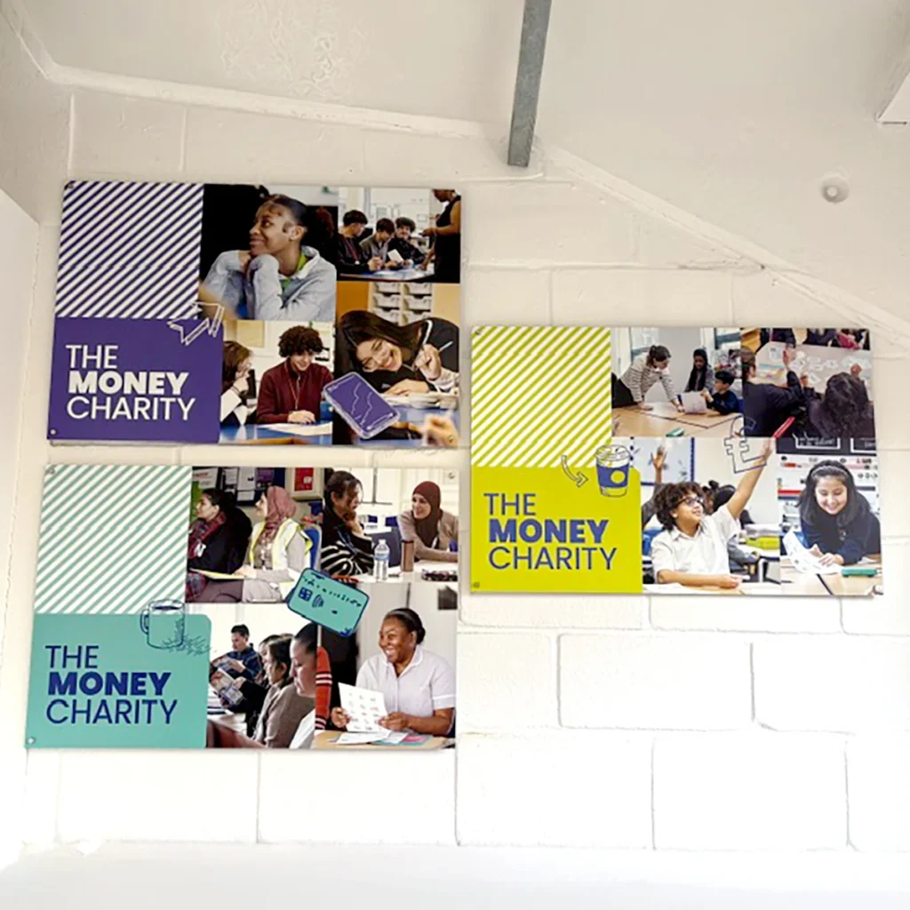
- A fresh new central brand alongside three different sub-brands tailored to the charity’s wide main audience groups.
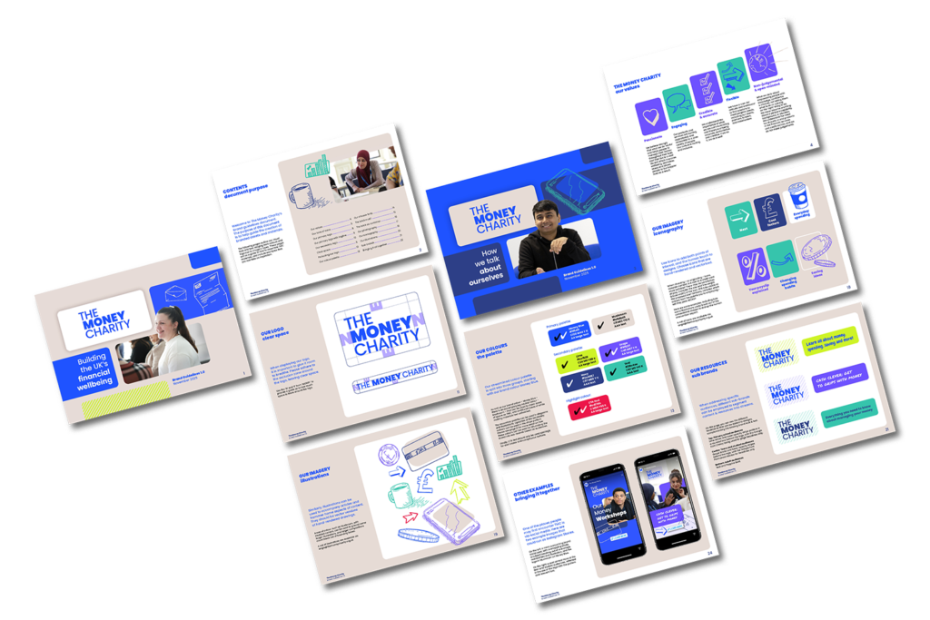
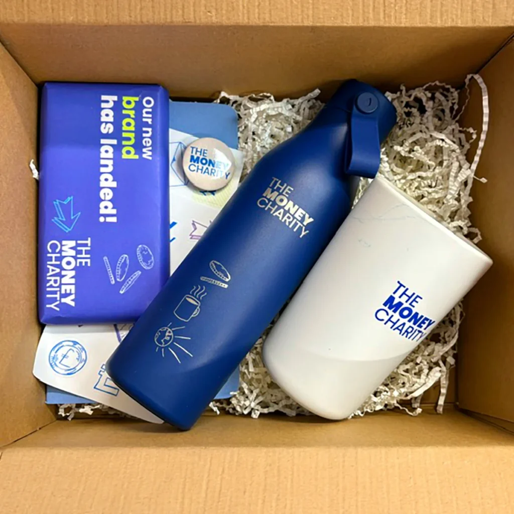
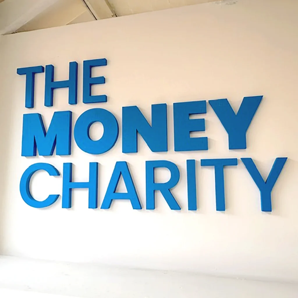
- Updated visual elements, including a new logo, colour palette, typography, and other core components.
- Created a cohesive contemporary identity that balances professionalism with approachability.
The Background
As part of our annual commitment to giving back, Arke selects a small number of charity or community-focused projects each year to support on a pro bono or reduced-fee basis. We connected with The Money Charity after learning they were looking for support with their branding.
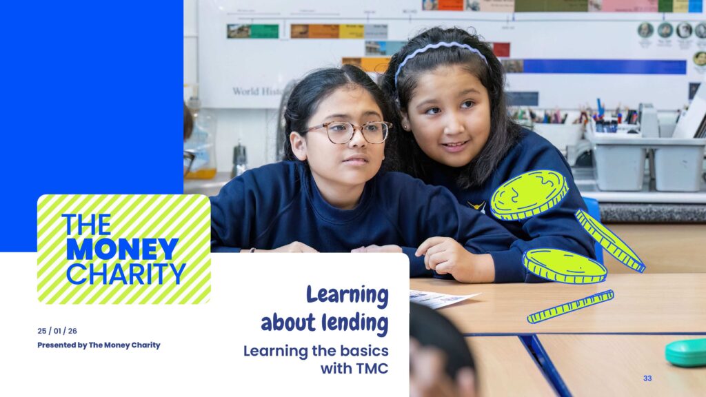
That’s how our relationship with The Money Charity began – they’re a charity that empowers people across the UK to develop the skills, knowledge, attitudes and behaviours to make the most of their money throughout their lives by providing education, information, advice and guidance to people of all ages and life stages, and were looking to reimagine their central brand and update their internal and external communication decks.
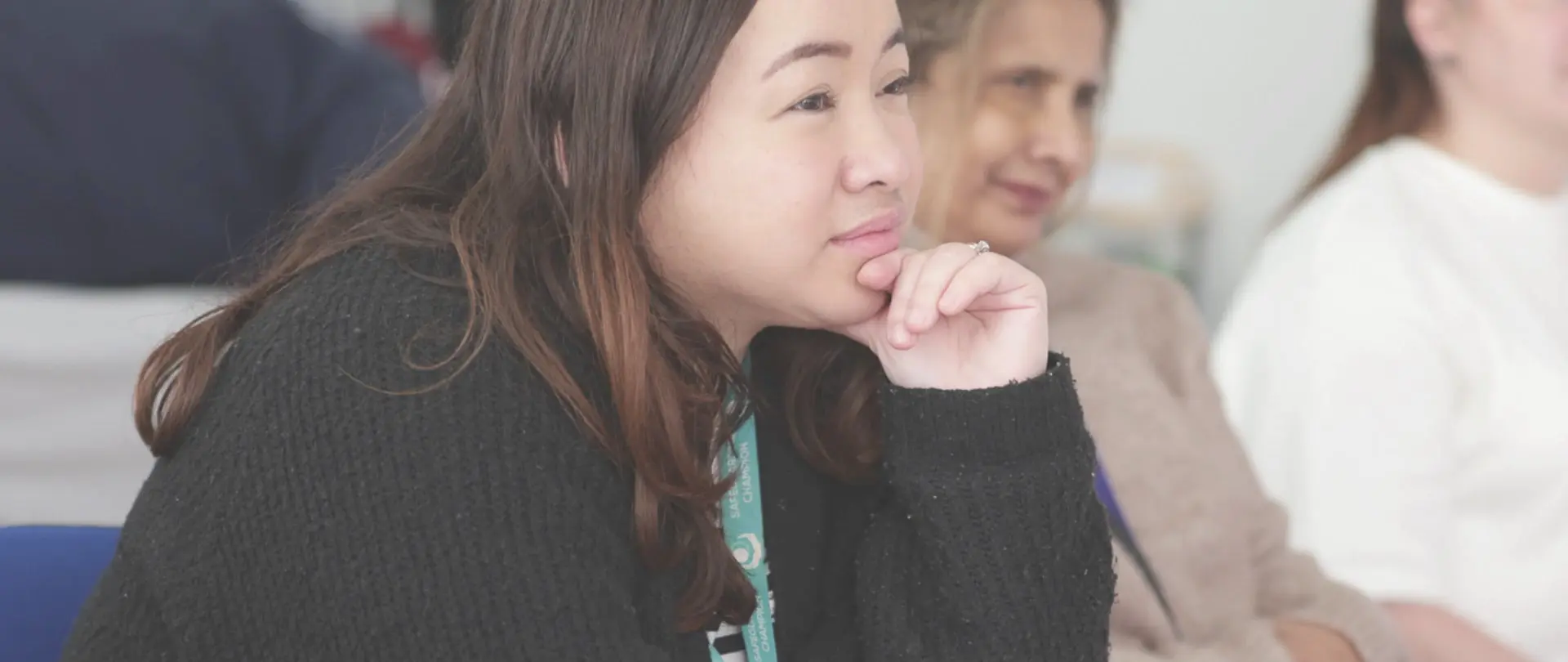
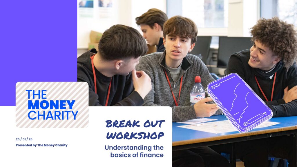
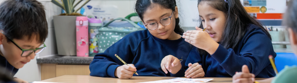
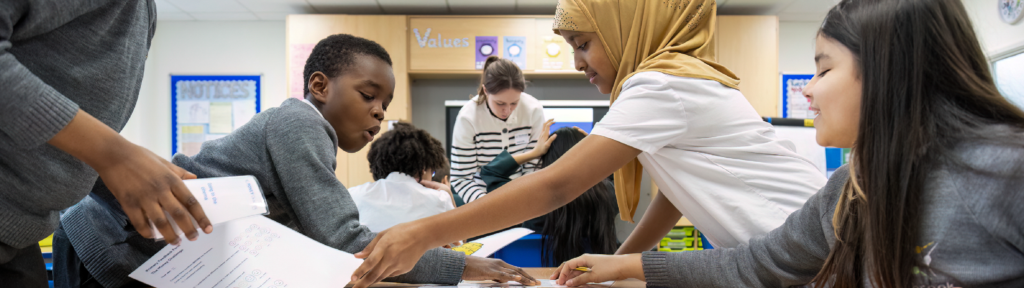
As The Money Charity aims to help children and people of all ages, the brand needed to resonate across a wide and varied audience spectrum:
- Children (primary school age)
- Young people (tweens, teens, students)
- Adults across different demographics and life stages
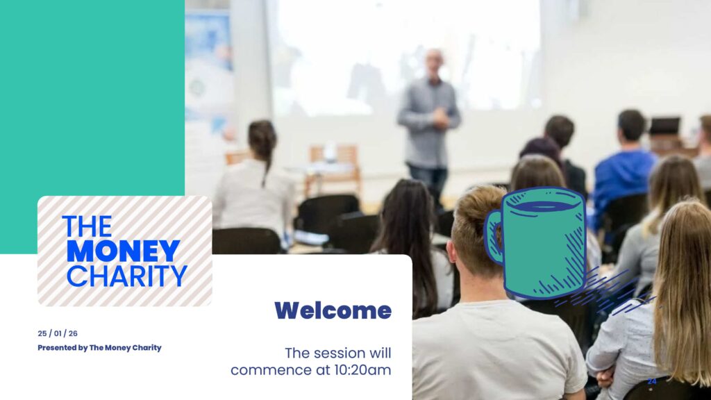
They also work with large corporations to deliver training on financial well-being. This mixed audience required a careful balance between professionalism, clarity, and approachability.
The Mission
The project focused on delivering a full rebrand that would:
- Refresh and modernise a brand that had remained largely unchanged for over a decade.
- Improve accessibility and relevance for diverse audiences.
- Provide clear internal guidance for consistent brand application.
- Lay the visual foundations for a new website experience.
Our goal was to develop a flexible and accessible brand system
that empowered the team to produce high-quality materials independently.”
Matt Stokes
Arke’s Head of Creative


The Strategy
We began with a collaborative discovery phase, engaging key stakeholders through a deep-dive online workshop and explored how to convey the organisation’s history and existing brand perception visually.
From this workshop, we identified the need to create a flexible identity system that supports multiple audience segments.
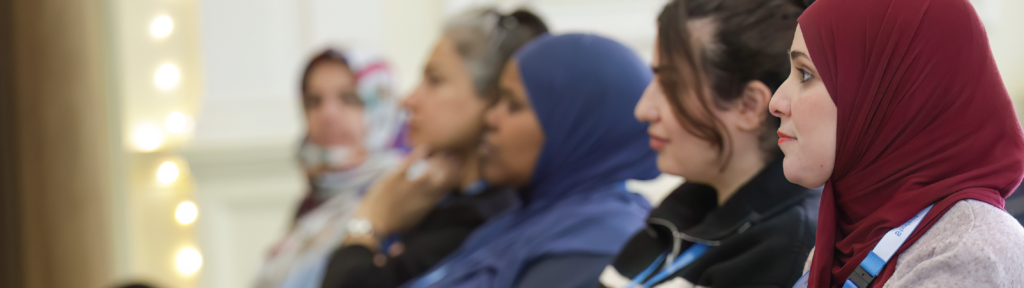
We also discussed key audience needs and expectations, presented a competitor analysis, broader landscape research and positioning opportunities, by working directly with the team at The Money Charity, who have client-facing roles and knew their audiences and provided the training to all, from students to corporate groups.
This transparent and detailed communication ensured alignment on both creative direction and strategic intent.
The Creatives
After the deep-dive discovery workshop, we developed multiple creative routes:
- A refined evolution of the existing identity
- A more progressive and expressive reinterpretation, which included the creation of subbrands to resonate with different audiences
We continued to have open ideation sessions with the key stakeholders, providing an iterative approach which allowed stakeholders to explore bolder directions before ultimately selecting a more balanced and versatile solution.
The selected concept was developed into a complete brand system:
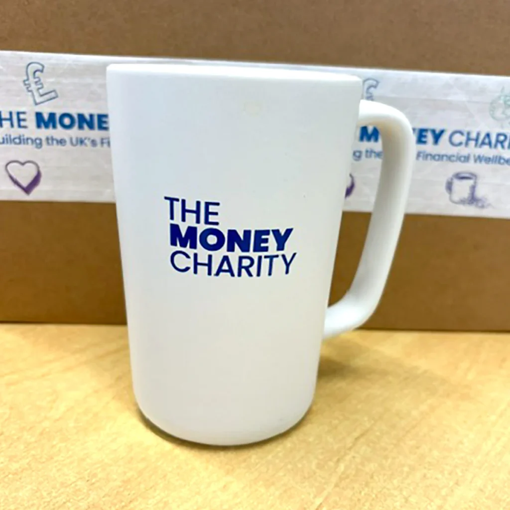
- Creation of a fresh new central brand with supporting sub-brand variations.
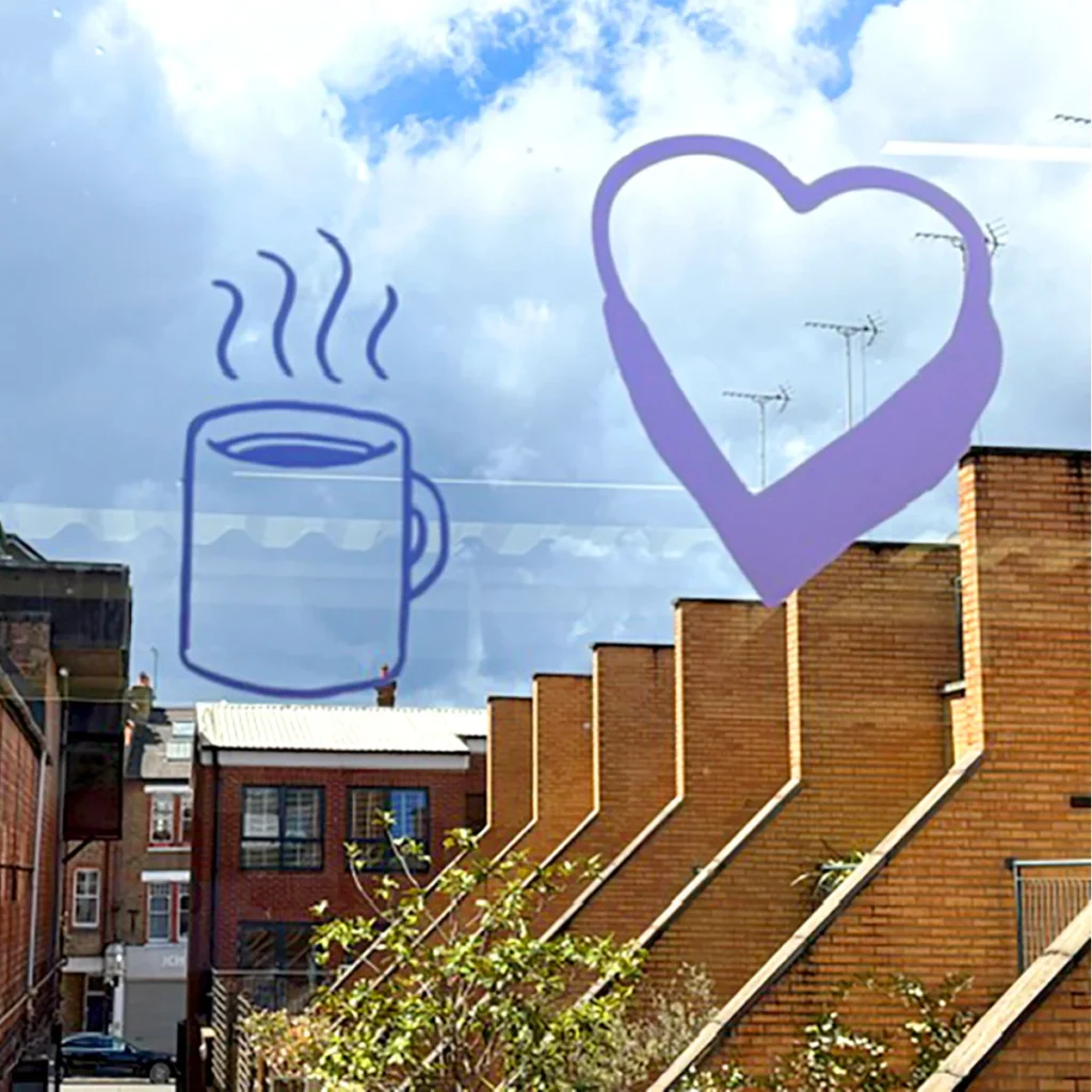
- Updated logo, colour palette, typography, and visual language, which included an illustration style to guide future creatives.
- A cohesive identity designed to work across multiple audiences and channels.
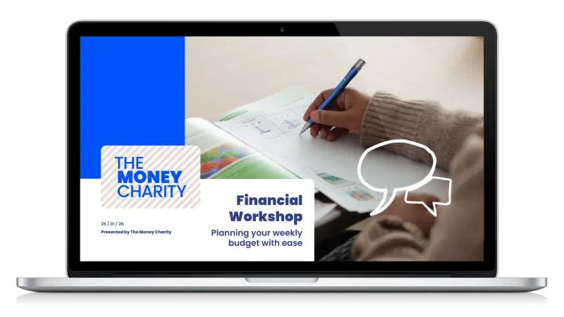
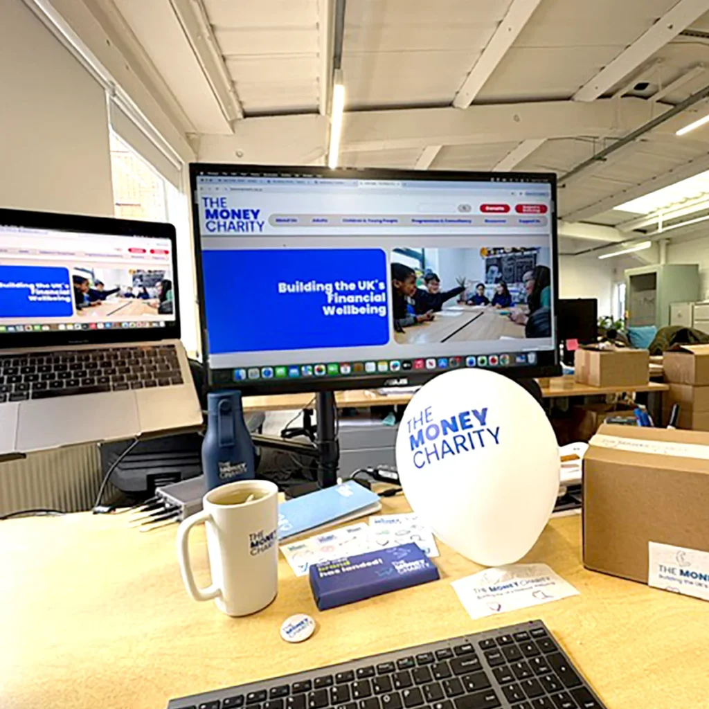
We then consolidated this into a comprehensive and practical Brand Guidelines Document, a style guide for internal and external use, website visual concepts and templates to guide future development, presentation templates (PowerPoint) and supporting marketing and communication assets.
The Results
We delivered to The Money Charity:
- A modern, credible, and approachable identity.
- A flexible system that works across diverse audience groups.
- Clear, user-friendly guidelines enabling consistent brand application.
- Digital-ready assets supporting the website rebuild by their team.
The Money Charity’s fresh look and improved website support ongoing growth, engagement, and impact across audiences ranging from children to adults to corporate partners all throughout the UK.
The new brand assets are also being used to create presentations and reports shared with policymakers and stakeholders, demonstrating the importance of a clean, accessible, and memorable brand identity.
The Impact
This brand redesign for The Money Charity shows what thoughtful, strategic branding can do.
By creating a flexible, modern identity system for a wide range of audiences, we helped position the charity for stronger engagement, better accessibility and long-term growth.
Effective charity branding is about more than aesthetics: it’s about helping organisations communicate their mission clearly, confidently and consistently. At Arke, we believe charity branding should empower organisations to grow, evolve, and amplify the work they do every day. Looking to elevate your charity branding and create a brand identity built for long-term impact? Let’s get started today.
We needed a brand that modernised the charity, preserved our fun, whilst also having credibility and gravitas.
No mean feat to balance all those elements. But Arke did it – and we love the end result!”
Michelle Highman
Chief Executive at The Money Charity
Related Case Studies
Let's get started
Got a mission for us? The Arkenauts are all ears! Book a call, drop your brief or enquiry into our digital portal, and we’ll be in touch straight away!