Allsorts Youth Project
Creative refresh for Allsorts Youth Project's training material
CASE STUDY
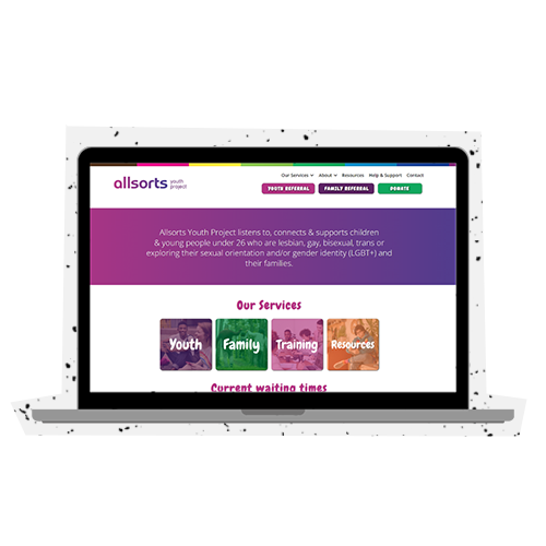
Here at Arke, we’re big on community, so it’s important to us that we give back to our local areas. Regularly taking on passion projects, we were delighted to work with Allsorts Youth Project supporting their mission of listening to, connecting & supporting children & young people under 26 who are lesbian, gay, bisexual, trans or exploring their sexual orientation and/or gender identity (LGBT+) and their families.
So, when we were asked to redesign their training slides in order to support their message and help create some fresh content and assets that showcase the incredible work that they do, we jumped at the opportunity.
The challenge
Allsorts Youth Project is an LGBT youth charity in East Sussex. The project aims to meet the needs of lesbian, gay, bisexual, trans and unsure youth in Brighton and Hove and the wider East Sussex area.
With this in mind, Allsorts tasked us with the responsibility of redesigning their entire training material that would be used to inform businesses and enterprises around East Sussex on inclusivity best practice in the workplace.
It was important for us to create a sense of professionalism within the slides whilst also bringing the fun and personal essence Allsorts has to amplify the motivations and pride within the brand.
Our main aims were to:
1. Make the slides a visually appealing & enhancing learning experience.
2. Look professional, slick, bold, to appeal to the consumer and business audiences.
3. Still represent Allsorts key brand essence, its values and services.
How did we go about this?
In order to create slides that were professional yet still captured the essence of Allsorts we had to think outside of the box.
For the first step of the research phase, it was incredibly important for our company to receive the educational training Allsorts provides, to better ourselves as a business and ensure inclusivity throughout our internal and external communications.
The training delivered by Allsorts allowed us to immerse ourselves in the experience of prospective companies that would be receiving the slides. This allowed us to truly understand how important the training is and how we could ensure all of the content resonated in the audience’s mind.

From here, we developed a range of ideas based on a Pinterest board Allsorts presented to us to discover shapes, colours and imagery that truly reflected the clients passion and dedication to the Youth Project cause. From this, we then developed three different mood boards featuring a variety of aspects that Allsorts had favoured, and in turn gave each one its unique stylistic approach.
Although Allsorts desired to go with a professional proposition, we didn’t want to lose what they stood for within the design, so decided to include a ‘wildcard’ concept that embraced abstract shapes and eye-catching colours – something we feel represented being proud of who you are, an asset Allsorts so effortlessly teaches to others.
Conducting regular check-ins with the client, we monitored feedback throughout and enhanced each of the three approaches to match. We explained to Allsorts our aim to keep the message of embracing who you are alive within the slides, without having to tone down their proud, aspirational and significant objectives as a company within a more corporate design. The client put their trust in us and we went forward with the concept that shouted Allsorts from the rooftops.
Our approach to design
We wanted the main focus of the design to be the incredible training Allsorts delivers. It was important for both us and the client to create content that enhanced Allsorts messaging whilst remaining eye-catching and engaging to the receiver.
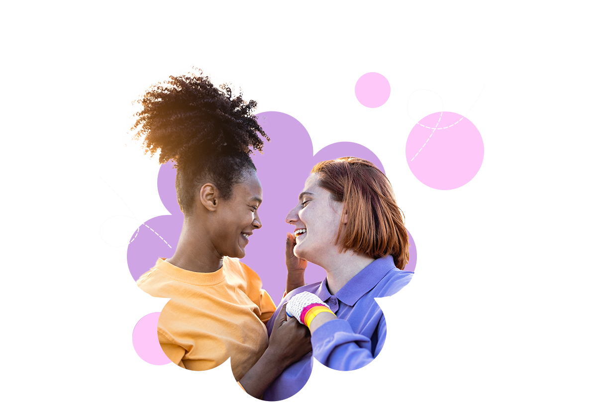
We began by researching image banks to depict a collection of LGBTQ+ friendly images that did not appear too generic or out of touch, but yet aligned with what Allsorts stood for. From here, we collated imagery that represented LGBTQ+ communities from a wide range of backgrounds, yet highlighted Allsorts work with youth across Sussex.
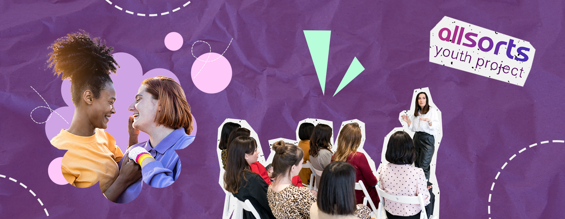
We originated ideas from what it truly means to be different, focusing on curvature within the design to emphasise not staying on one path, embodying non-binary directions. Embracing a mix of pastel colours that aligned with Allsorts logo, we focused on using shapes and overlays to create depth and dimension amongst the slides. We placed these on the borders of slides, using them to utilise white space.
We paired this with sketchbook-esk doodles, based on the idea that they encapsulate the heart of the people the charity helps. Although the topic is series, each person has their own story to tell, portrayed through interactive, seemingly hand drawn doodles you may find in a diary/sketchbook. The doodles interacted with the shapes, adding the essence of fun to the graphics, without going overly youthful.
We developed these shapes to enhance text and statements within the training, focusing the trainee’s eye on important messaging to ensure all educational content could be clearly understood.
As the shapes began to take formality within the slides, we started to harness the collaboration of imagery. Placing the images in unison with the shapes, we evolved the images by including them within the shapes using masks and overlays, combined with the sketched doodles to ensure all assets flowed throughout the presentation.

Results
We were delighted that Allsorts were incredibly happy with the slides created and are now using them to train businesses across the county on inclusive behaviour within the workplace.
So far the slides have been shown to 11 businesses and the charity expects to deliver further training to 52 businesses this year – that’s a whole lot of eyes on these slides and we couldn’t be more proud!
Due to the relationship forged with Allsorts, we are proud to be supporting them with the next stage of their journey, creating a mix of video content featuring important messages from alumni, users of their service and staff. The content will go live over Pride weekend, and we are now thinking of ways to ensure this celebrates Allsorts and what they stand for as much as possible.
We are incredibly happy with the work Arke has done on our training presentations.
It is truly invigorating to have our content displayed in a professional yet refreshing manner”
Allsorts Youth Project
Related Case Studies
Let's get started
Got a mission for us? The Arkenauts are all ears! Book a call, drop your brief or enquiry into our digital portal, and we’ll be in touch straight away!
